 What changed?
diff html
A header that grew 48px and pushed everything down
Two versions of one page, compared per viewport: the pixel diff, the computed-style diff that explains it, and a triptych image.
Open the page under test · fixtures/shift-patterns/header-grow.html · baseline.html
Run it
vlmkit diff html fixtures/shift-patterns/baseline.html fixtures/shift-patterns/header-grow.html --output {out}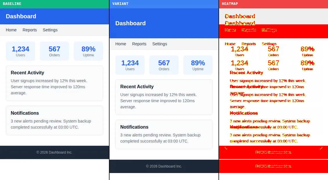
diff html writes it.What to look at
A raw pixel diff says 18.9% changed. The shift detector says one thing happened: everything below the header moved +48px, and after undoing the shift only 5.8% differs.
The fix
Restore the header's padding (the computed-style diff names height, padding-top, padding-bottom).
What vlmkit printed
vlmkit diff html fixtures/shift-patterns/baseline.html fixtures/shift-patterns/header-grow.html --output {out} · exit 0
  Breakpoint discovery: regex
  ! Crater breakpoint discovery unavailable, falling back to regex: Error: connect ECONNREFUSED 127.0.0.1:9222

╔═══════════════════════════════════════════════════════════════════════════╗
║  Migration VRT Compare                                                  ║
╚═══════════════════════════════════════════════════════════════════════════╝
  Baseline: fixtures/shift-patterns/baseline.html
  Variants: fixtures/shift-patterns/header-grow.html
  Viewports (3): mobile(375), desktop(1280), wide(1440)

  Paint tree: unavailable (Crater BiDi unavailable at ws://127.0.0.1:9222) — using Playwright computed-style + DOM-position fallback

  header-grow vs baseline
    ✗ mobile       18.9% (63727 px) [17 layout-shift] <.stat-box { flex }> [shift +48px → 5.8%]
    ✗ desktop      16.6% (191035 px) [1 layout-shift] <.stat-box { flex }> [shift +48px → 5.5%]
    ✗ wide         16.5% (213474 px) [1 layout-shift] <.stat-box { flex }> [shift +48px → 5.5%]
  DOM-position diff: 3 tuples across 1 paths. Top properties: height(1), padding-bottom(1), padding-top(1)
  Shift origins: 6 explanation(s) across 3 viewport(s)
  Per-viewport DOM-position diff: 9 tuples, 3 unique (path, property) pairs, 0 appear only on a subset of viewports (media-query-gated)
  Computed-style diff: 3 (selector, prop) tuples. Top properties: height(1), padding-bottom(1), padding-top(1)
  Per-viewport CSD: 3 unique pairs (3 universal, 0 breakpoint-gated)
  Component bbox diff: 5 component delta(s) across 1 viewport(s)
  Heatmap regions: 24 cluster(s) across 3 viewport(s)
  Text-row shifts: 30 row(s) with Δy across 3 viewport(s)
  Wireframe fix suggestions (6, top 5):
    [medium] [SUBSET] component rank=1 (bbox 375×94): Δtop +244px on mobile (subset — gate with media query; not seen on desktop, wide)
      → try reducing top spacing by 244px (≈ 244px) ⚠ component height differs intrinsically: 123px (now) → 94px (target). The shift may NOT be a spacing-token issue — check this component's own padding / min-height / font-size before adding margin upstream.
    [medium] [SUBSET] component rank=0 (bbox 335×123): Δtop -196px on mobile (subset — gate with media query; not seen on desktop, wide)
      → try adding top spacing by 196px (≈ 196px) ⚠ component height differs intrinsically: 142px (now) → 123px (target). The shift may NOT be a spacing-token issue — check this component's own padding / min-height / font-size before adding margin upstream.
    [medium] [SUBSET] component rank=2 (bbox 335×102): Δtop +48px on mobile (subset — gate with media query; not seen on desktop, wide)
      → try reducing top spacing by 48px (≈ 48px) ⚠ 4 suggestions converge on header (body[0]>header[0]) (mobile): cumulative 48px + 48px + 48px + 24px = 168px. Treat each individually and you risk compound overshoot — consolidate into one edit that resolves all together.
      candidate: header (body[0]>header[0]) (height: 103px (now) → 55px (target)) [cascades to siblings]
    [medium] [SUBSET] component rank=3 (bbox 375×46): Δtop +48px on mobile (subset — gate with media query; not seen on desktop, wide)
      → try reducing top spacing by 48px (≈ 48px)
      candidate: header (body[0]>header[0]) (height: 103px (now) → 55px (target)) [cascades to siblings]
    [medium] [SUBSET] component rank=4 (bbox 101×66): Δtop +48px on mobile (subset — gate with media query; not seen on desktop, wide)
      → try reducing top spacing by 48px (≈ 48px)
      candidate: header (body[0]>header[0]) (height: 103px (now) → 55px (target)) [cascades to siblings]
  Triptych: 3 viewport(s) → <out>/header-grow-<viewport>-triptych.png (baseline | variant | heatmap)

────────────────────────────────────────────────────────────────────────────

  Summary

  Variant                    mobile      desktop         wide
  header-grow                 18.9%        16.6%        16.5%

  Diff Categories
    header-grow        19 layout-shift

  Paint Tree
    Crater BiDi unavailable at ws://127.0.0.1:9222

  Fix Candidates
    header-grow        3x .stat-box { flex }, 3x .stats { display }, 3x .stats { gap }

  Convergence
    header-grow        remaining (3/3 unresolved)

  Report: <out>/diff-report.json