| D1 | eye L1 on S1 | #demo-title (.demo h2)
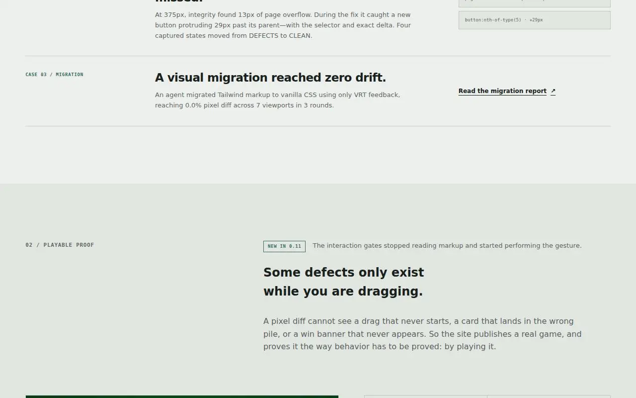
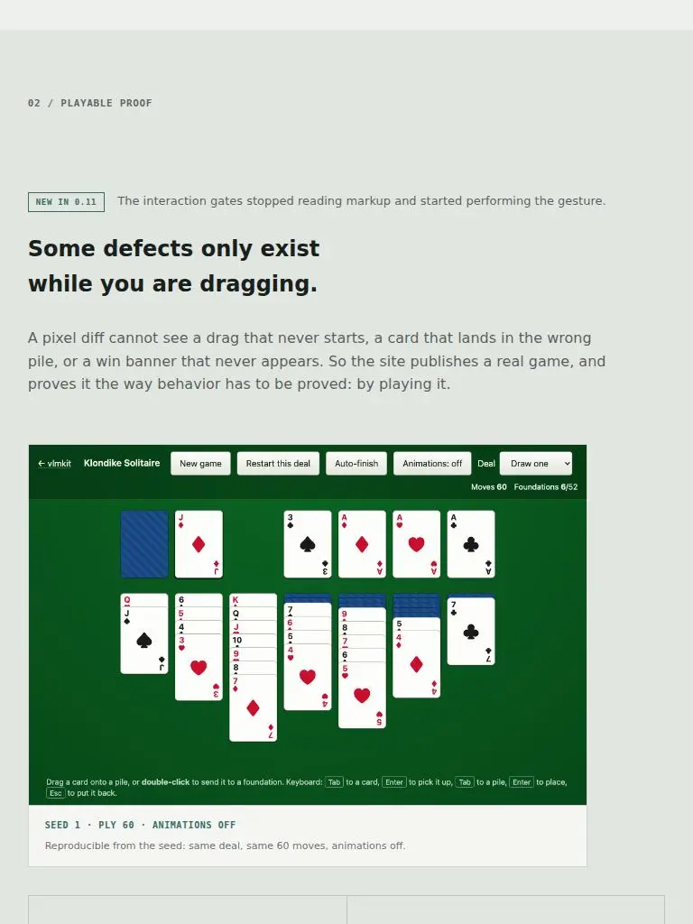
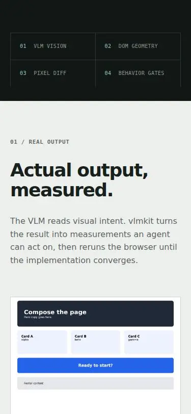
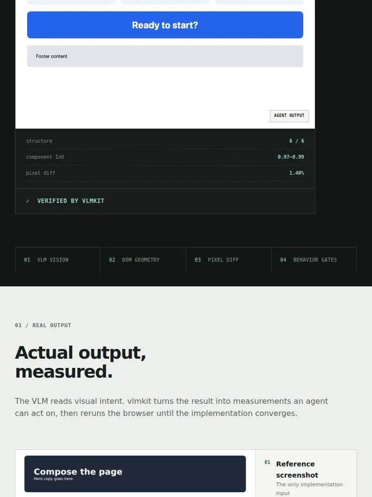
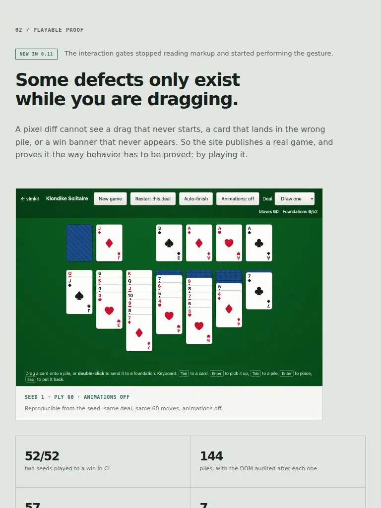
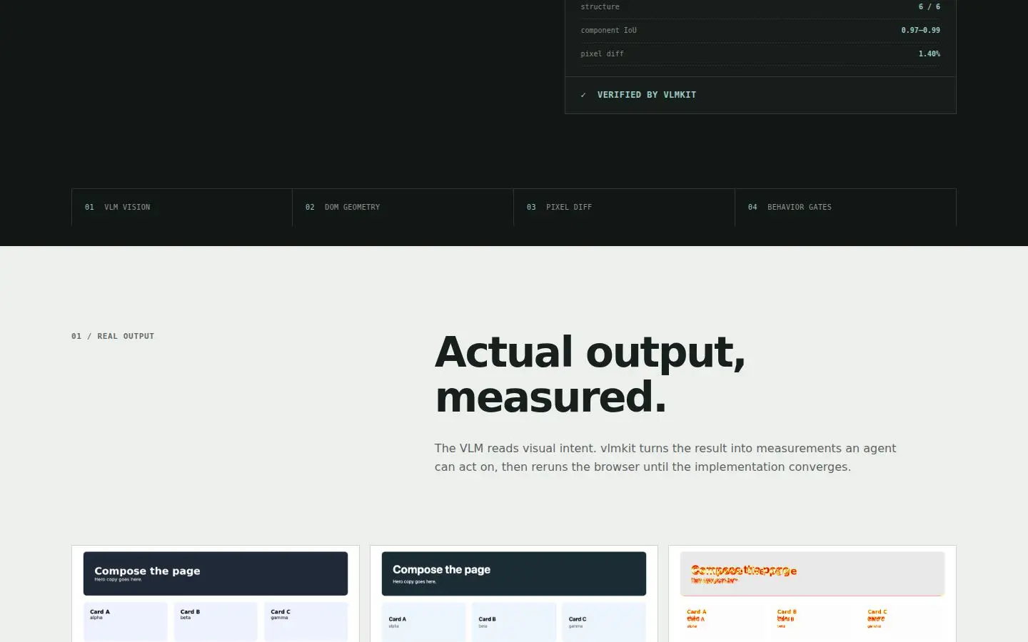
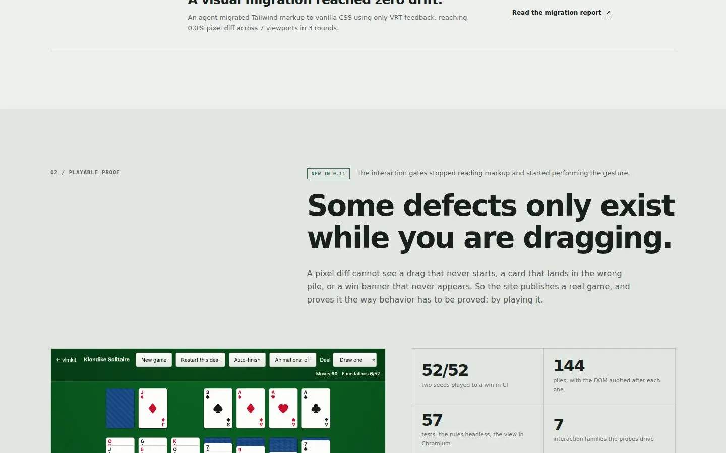
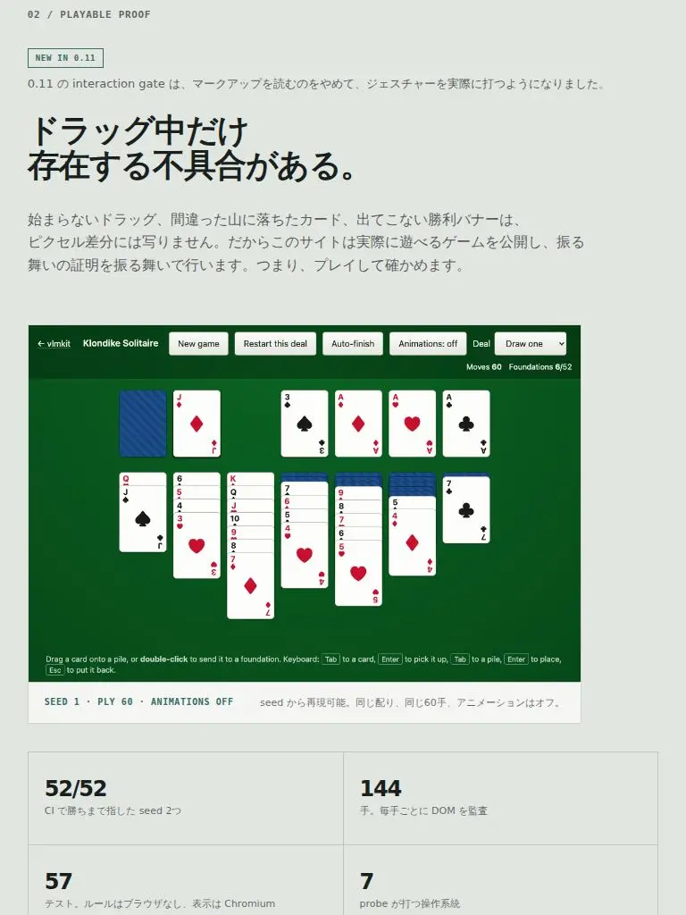
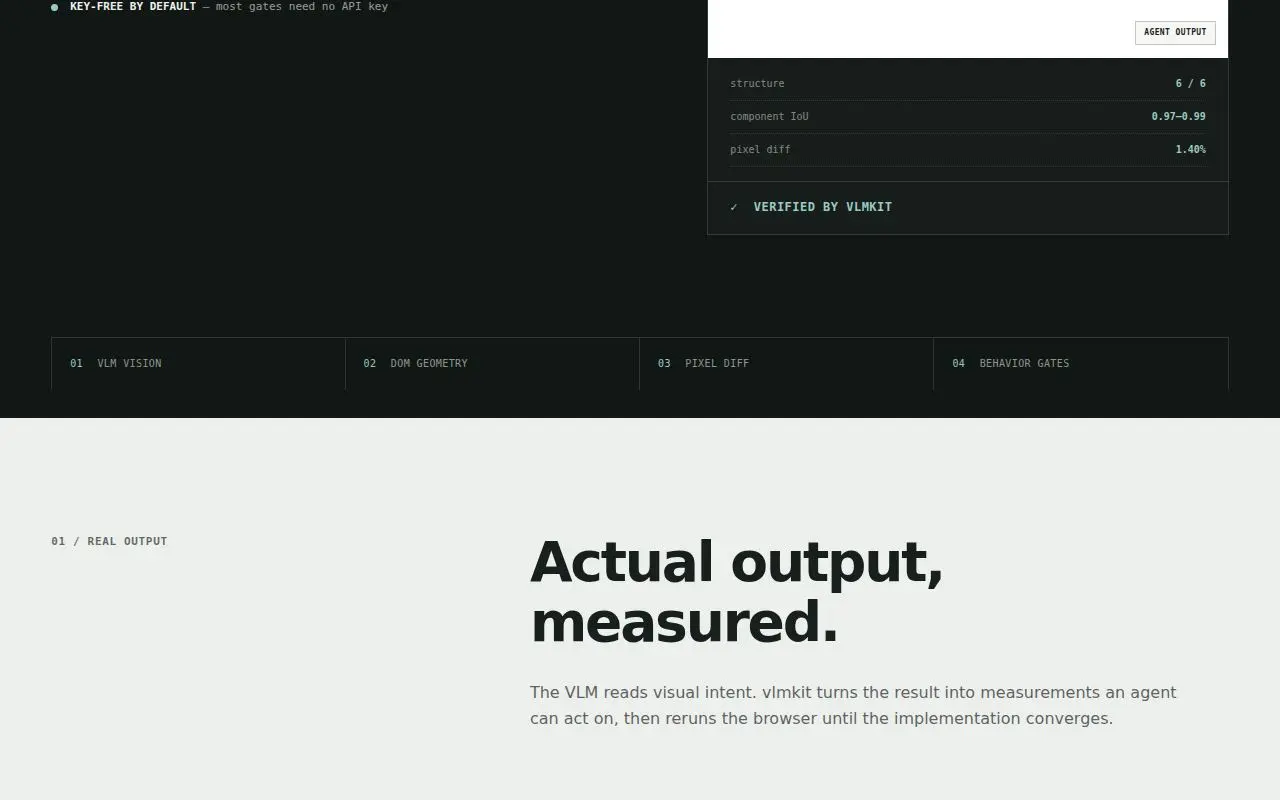
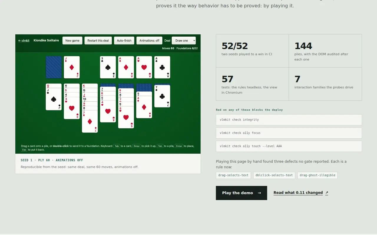
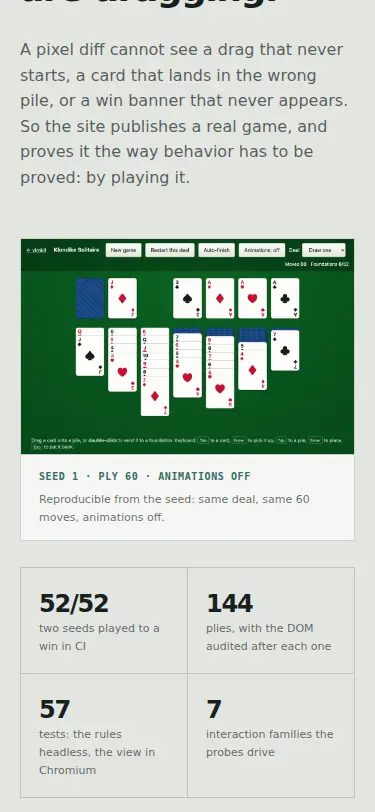
The 02 / PLAYABLE PROOF heading renders at the browser-default h2 size, 24px against 55–58px for every other section h2 at 1280 and 36px at 375. .demo h2 is missing from the section-heading size rule, which lists .section-heading/.proof/.commands-intro/.principle/.skills/.start only. It reads as a case-study title, not a section heading (S1 screen 4, S2 screen 6, S4 screen 4). check design G3 measured it: h2 has 2 styles with 1 one-off. But 7 instances at 3.5x reuse clears its 3x threshold, so it passed. | styles.css: added .demo h2 to the section-heading size rule (clamp(36px, 4.3vw, 58px), 1.08, -0.04em, 700). | G22 |
| D2 | eye L1 on S1 | #hero-title (.hero h1) at >=901px
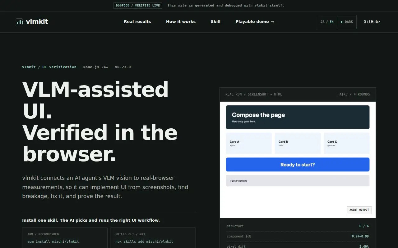
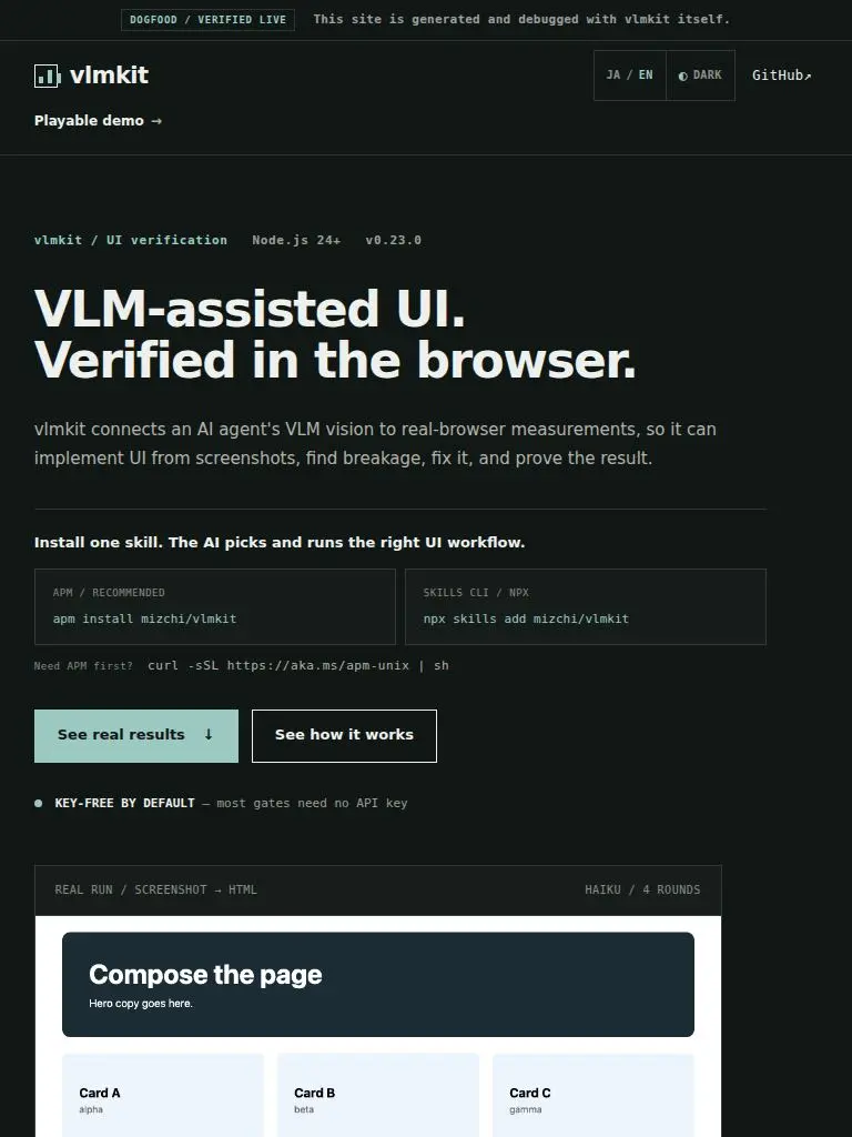
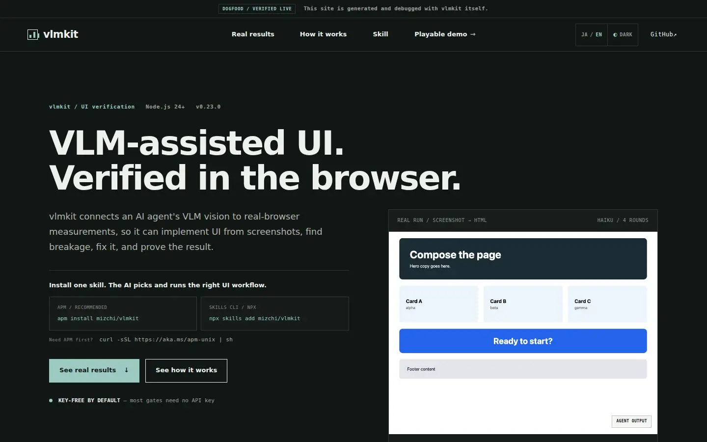
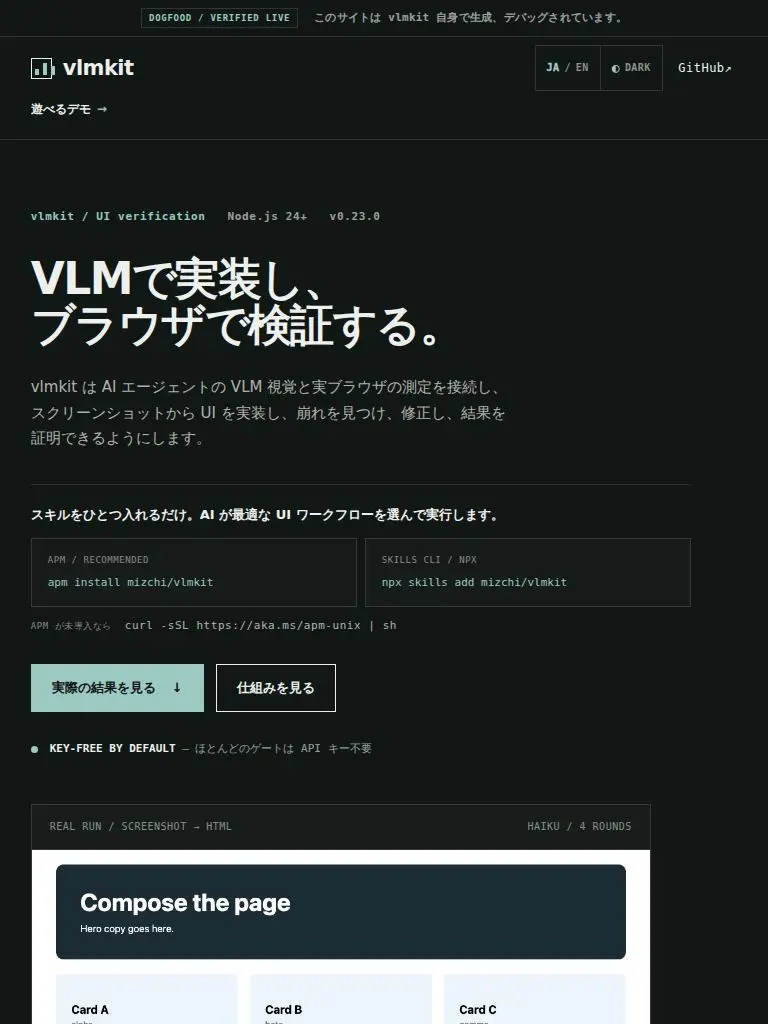
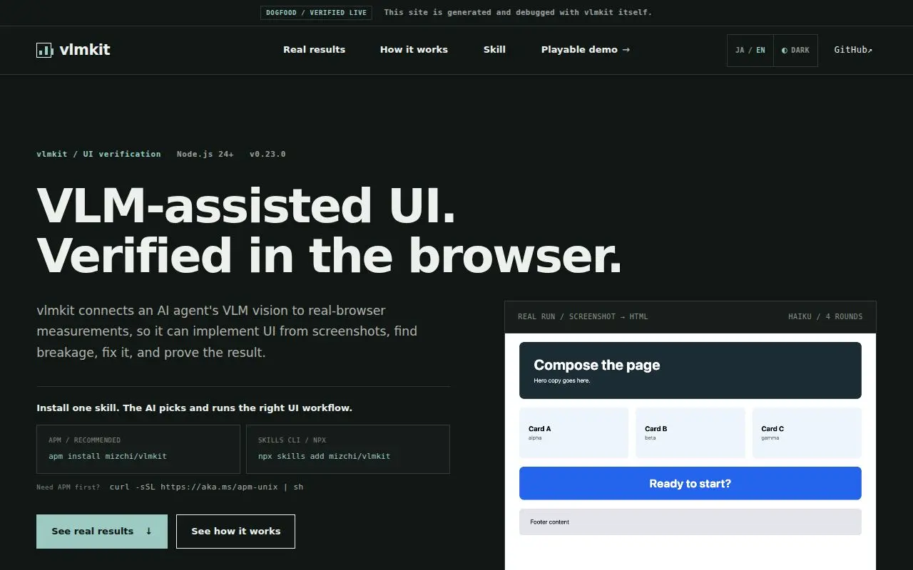
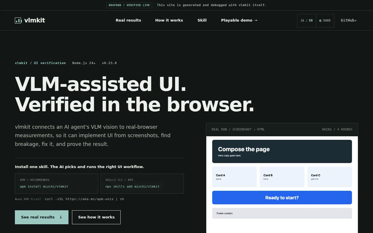
At 1280 the hero h1, written as two phrases split by a <br>, renders as four lines: 'VLM-assisted / UI. / Verified in the / browser.'. In Japanese it is 'VLMで実装し、 / ブラウザで検証す / る。' (S4). Two single-word lines, and the ~270px headline pushes both CTAs below the 800px first screen (S1 screen 2, y≈861–909). The h1 is confined to the left 558px column of a two-column grid, while each phrase needs ~835px at the pinned 66.56px size. The size is pinned by page.test.mjs, so the fix has to be the layout. | index.html: moved the eyebrow and h1 into a new .hero-heading grid item. styles.css: it spans grid-column 1 / -1 with a 28px margin-bottom; .hero-grid uses column-gap only, with align-items: start and align-content: center; the h1's 760px max-width is gone; .hero-lead drops its margin-top. At ≤900px (one column) the console keeps its old spacing as margin-top (clamp(44px, 6vw, 80px), 70px at ≤640). The font-size clamp pinned by page.test.mjs is unchanged. | L43 |
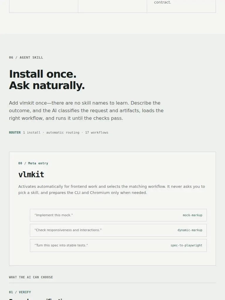
| D3 | eye L1 on S1 | .routing-examples (skill-entry card)
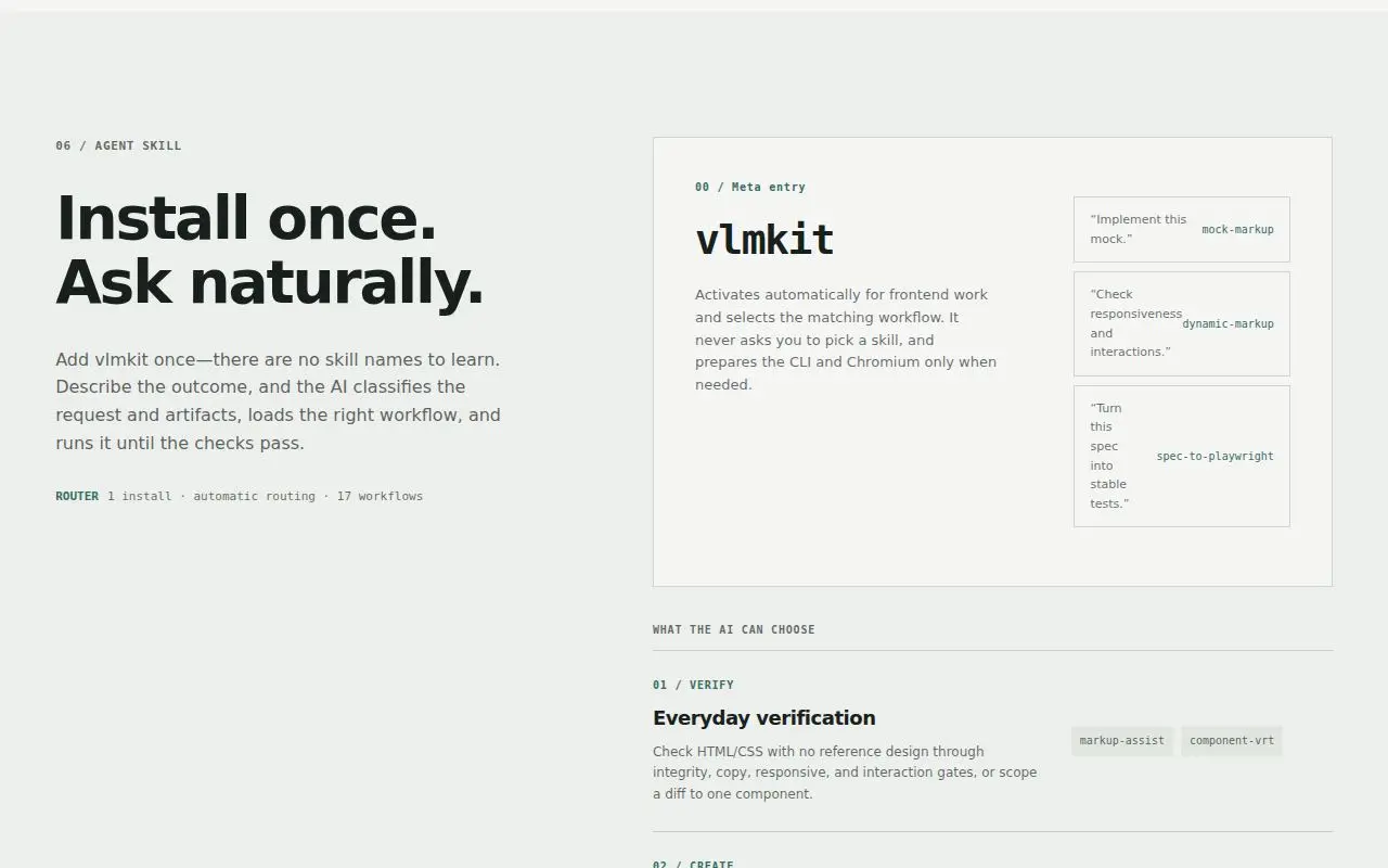
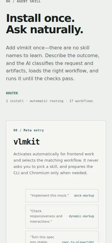
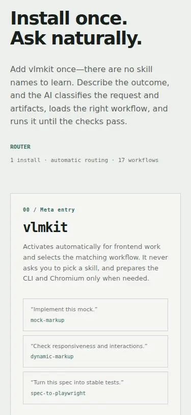
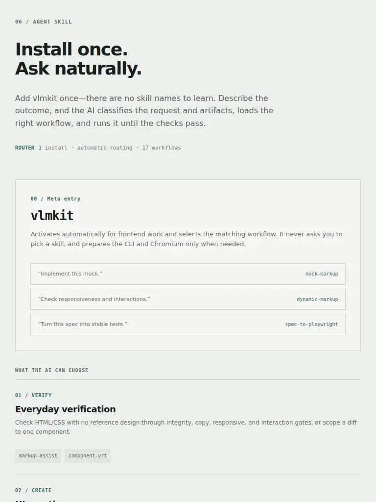
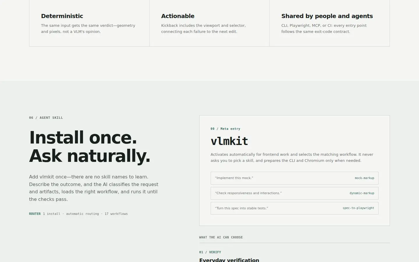
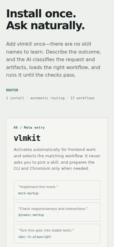
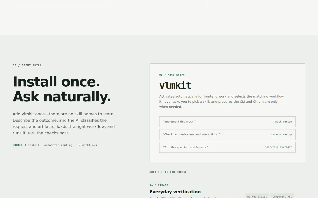
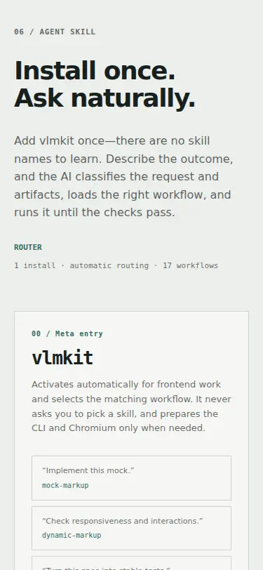
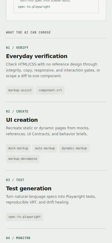
The three routing examples in the Meta entry card are squeezed into a ~50px column beside their skill chip. '“Turn / this / spec / into / stable / tests.”' is six lines of one word, and 'responsiveness' runs into 'dynamic-markup' (S1 screen 9, S6, S4/S8 in Japanese as 4-character lines). The card's second column is ~200px. The <ul> also keeps the UA 40px padding-left and 16px margins (list-style is reset, padding is not), which indents the rows 40px on tablet and phone (S2 screen 13, S3 screen 9). | styles.css: .routing-examples resets margin and padding (the UA 40px indent). .skill-entry is one column at every width, so the examples are full-width rows under the description. At ≤640px each row stacks its quote over its skill chip. | L25, L43 |
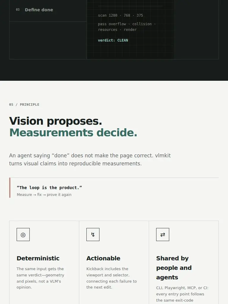
| D4 | eye L1 on S1 | .hero-grid, .measurement-strip, .workflow, .principle
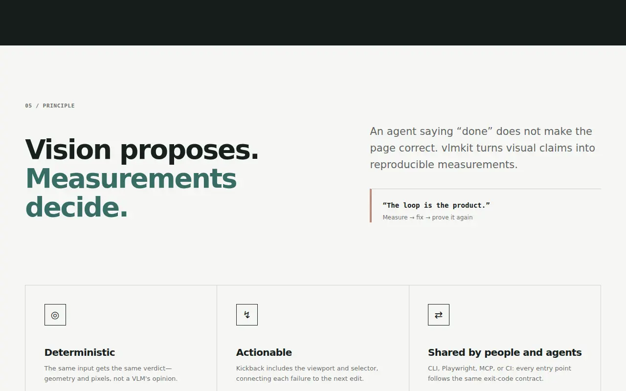
The page's left rail jumps between sections. At 1280, sections 01, 02, 04, 06 and 07 (and the header) start at x=51, but the hero, 03 / THE LOOP and 05 / PRINCIPLE start at x=71 (S1 screens 1, 6, 8). Those four boxes use max-width: var(--max) on the padded box itself, while the others put the 1240px limit on the content inside a gutter-padded section. Their content box is therefore 2×gutter narrower and offset by (viewport − 1240)/2. That makes the jump 20px at 1280, and it grows on wider screens. | styles.css: .hero-grid, .measurement-strip, .workflow and .principle use max-width: calc(var(--max) + 2 * var(--gutter)), so their content box matches the sections that cap content at --max inside a padded band. The full-bleed .start band gets padding-inline max(var(--gutter), (100% - var(--max)) / 2) so it holds the same rail on wide screens. | L30, L43 |
| D5 | eye L5 on S5 | h1, h2, h3 and short labels, :lang(ja) (and h3 widows in English)
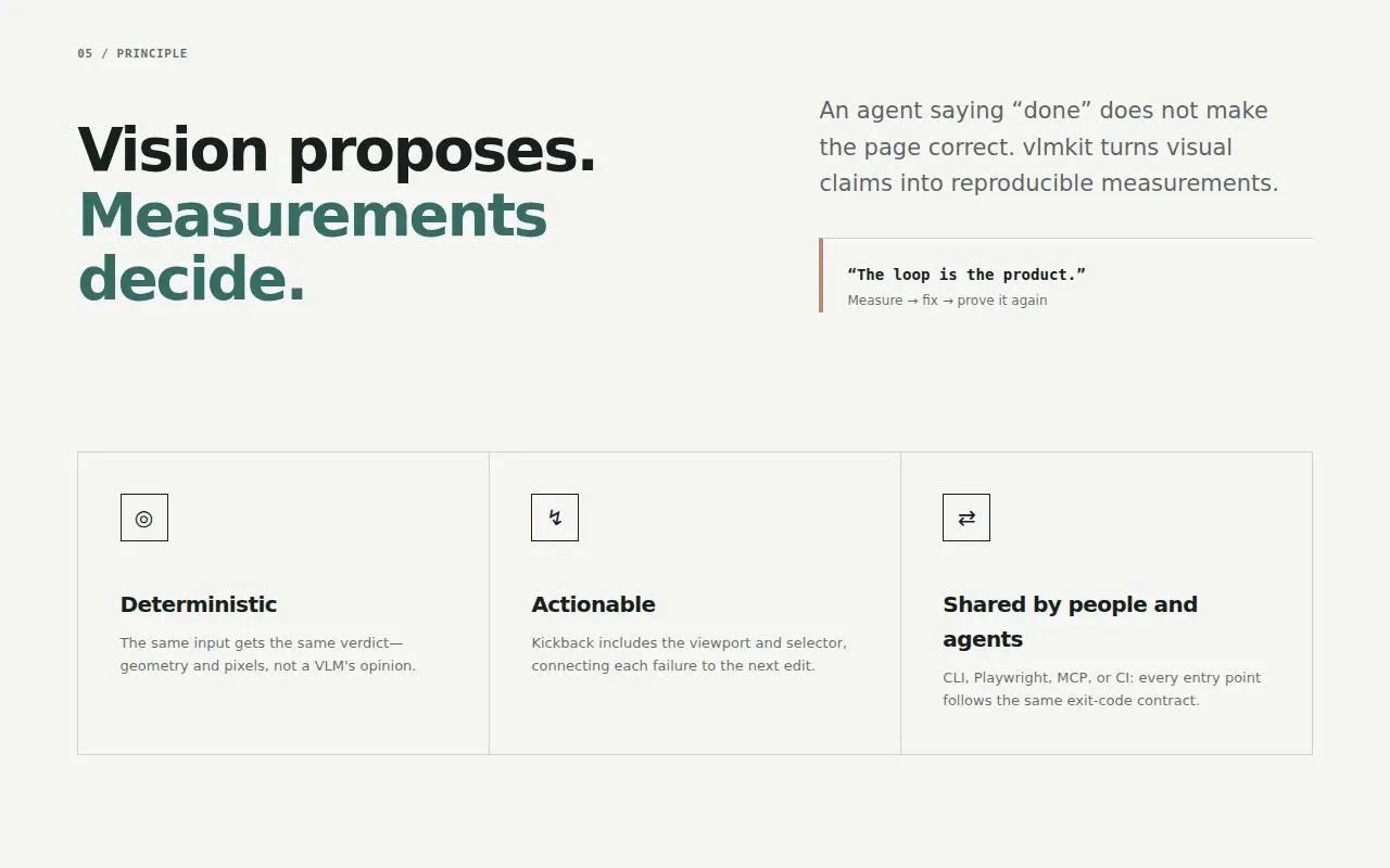
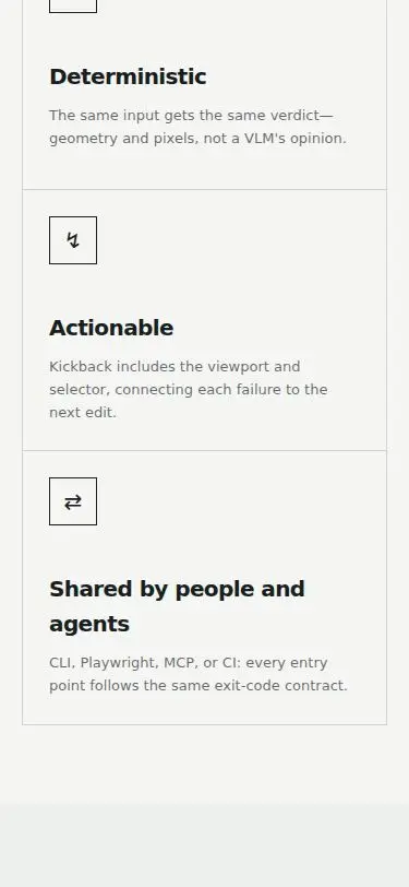
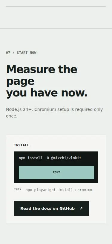
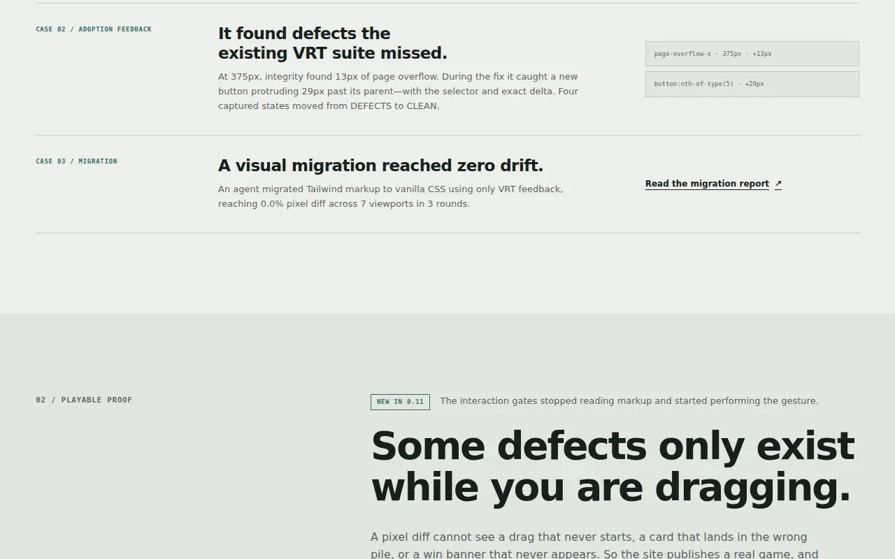
The Japanese headings break inside words and leave a kana or particle alone. Phone (S5): 'ブラウザで検証 / する。', 'ひとつのコマンド / へ。', 'あとは自然に頼むだ / け。', and 'まず、いまのページ / を / 測ってみる。' with a lone を. Desktop (S4): 'ブラウザで検証す / る。', 'まず、いまのペー / ジを'. Tablet (S10): '参照スクリーンショッ / ト'. The same happens in short lines: 'キー不 / 要', and 'ワークフロ / ー' with ー pushed to the next line. English has single-word widows in the h3s ('…from pixels / alone.', '…VRT suite / missed.', 'Shared by people and / agents') and 'Measure the / page' in the 07 h2 (S1 screen 12). | styles.css: h3 gets text-wrap: balance. Each h2 phrase span (h2 > span[data-i18n]) is an inline-block with text-wrap: balance, so each <br>-separated phrase balances on its own; the <br> stays for the accessible name. :lang(ja) headings and the short labels that broke (dogfood message, install lead, status, gallery titles, routing quotes, start note) get word-break: auto-phrase, and html:lang(ja) gets line-break: strict. I chose these from a scratch line-break measurement; the hero h1 is excluded because balancing it yields 'VLM- / assisted UI.' on a phone. | L32 |
| D6 | eye L4 on S4 | :root font-synthesis / :lang(ja) font stack
Every Japanese heading renders at regular weight beside bold Latin words in the same line: 'VLMで実装し、' with only VLM heavy, 'APM でインストール', 'Claude Code プラグインとして導入', thin h2s and h3s (S4, S5, S8, S9). The page sets font-synthesis: none on :root and names no Japanese family. This machine only has Regular Japanese faces (WenQuanYi Zen Hei, IPAGothic), so font-weight 700 cannot be honoured. check composition G5 still reports 'h1 66.6px / 700' for ja, because it reads computed style, not painted weight. | styles.css: html:lang(ja) names the Japanese system faces after the Latin ones (Hiragino Sans, Hiragino Kaku Gothic ProN, Noto Sans JP, Noto Sans CJK JP, Yu Gothic UI, Yu Gothic, Meiryo) and sets font-synthesis: weight. Bold is synthesised only where the Japanese face has none, so Mac and Windows with real bold faces are unchanged. | L31 |
| D7 | eye L2 on S2 | h3 (loop-list, proof-grid, skill-installer, skill-category)
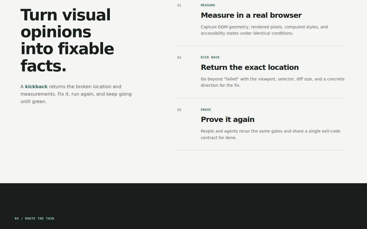
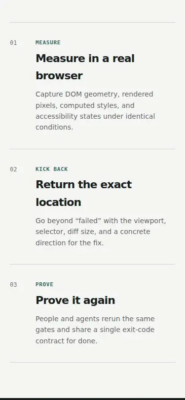
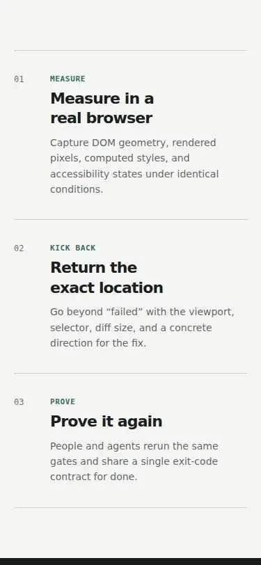
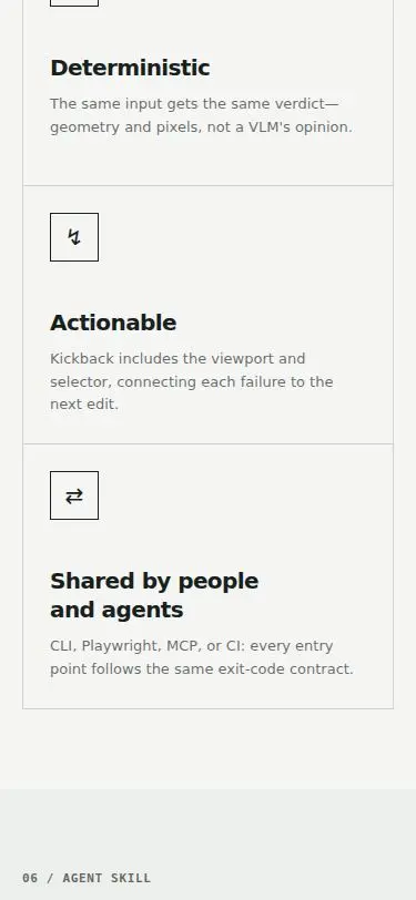
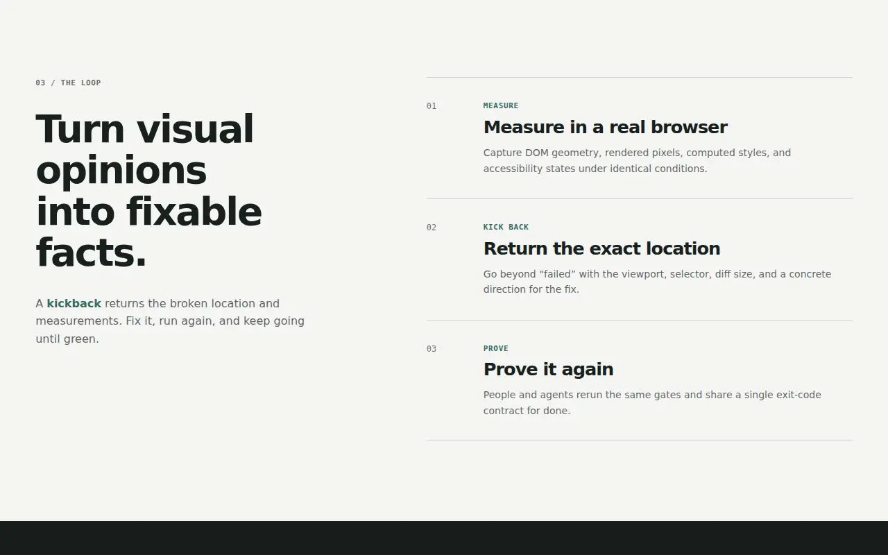
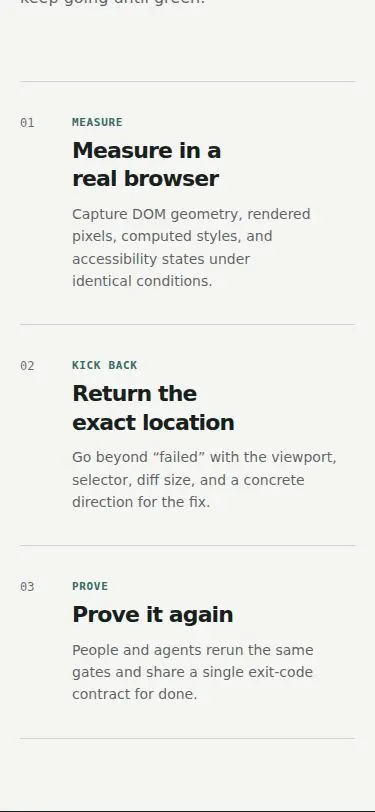
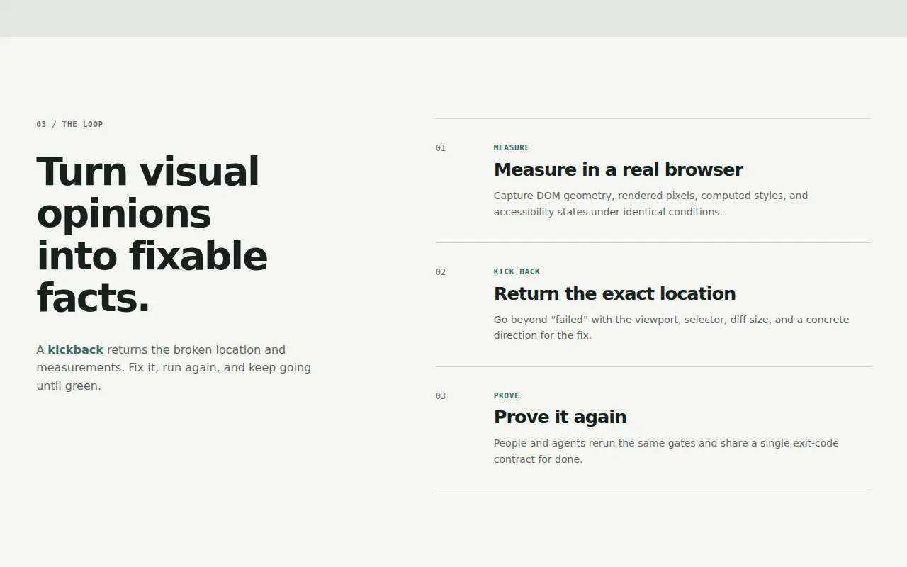
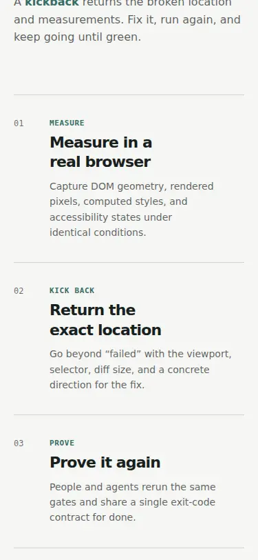
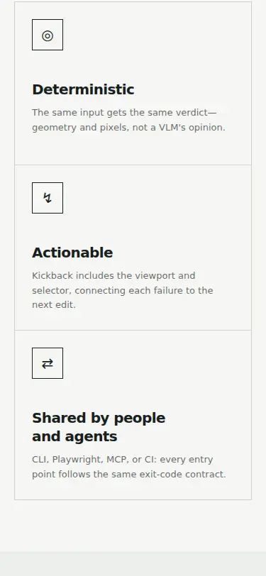
Multi-line h3s inherit the body line-height of 1.6, so a wrapped heading reads as two separate lines: 'Measure in a real / browser', 'Return the exact / location', 'Shared by people and / agents', 'Install as a Claude Code / plugin' (S2 screens 9, 12, 16; S3 screen 8 with three lines). Only .case-study h3 sets its own line-height (1.2). | styles.css: h3 { line-height: 1.3 } as the default, in the same rule as D5's balance. .case-study h3 keeps its own 1.2. | L25 |
| D8 | eye L3 on S3 | .proof-gallery figcaption at 641–900px
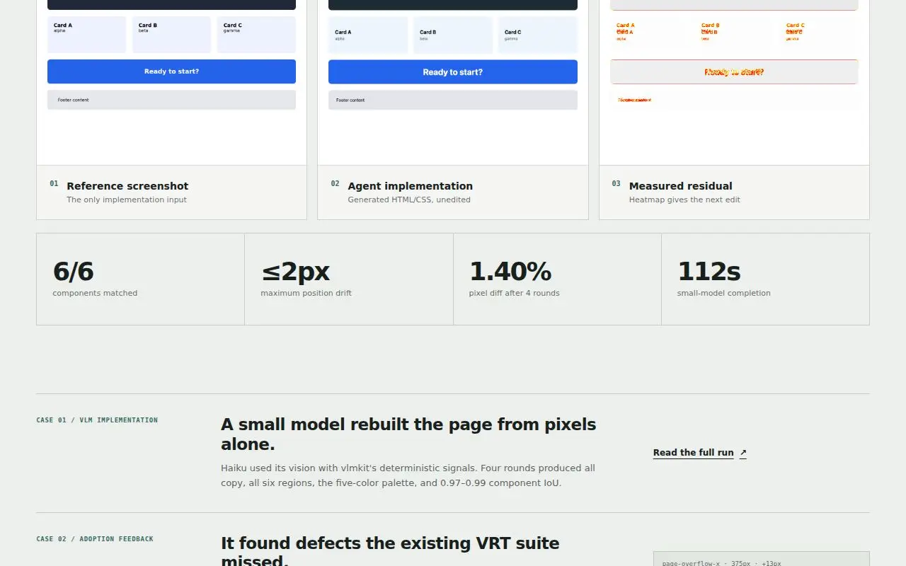
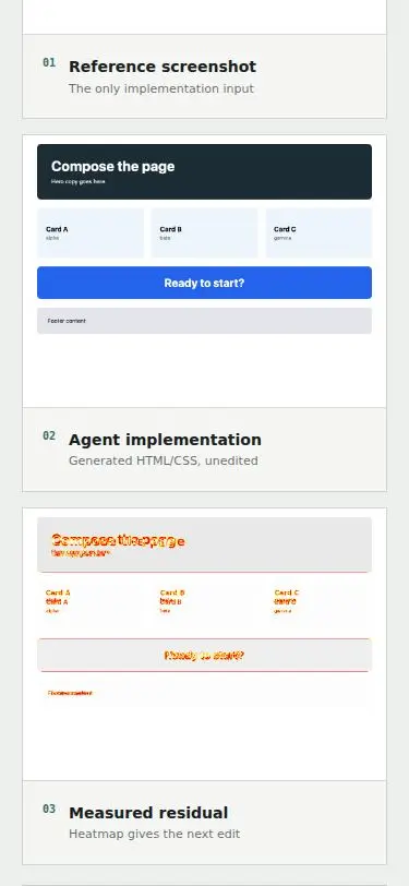
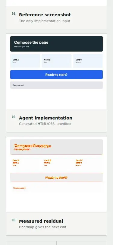
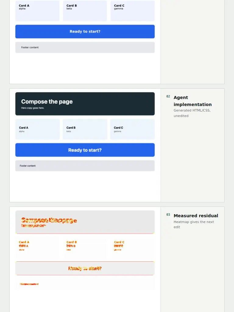
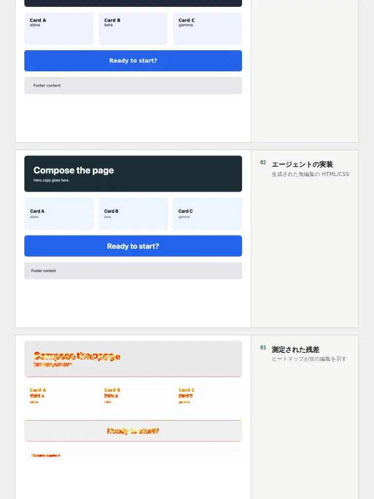
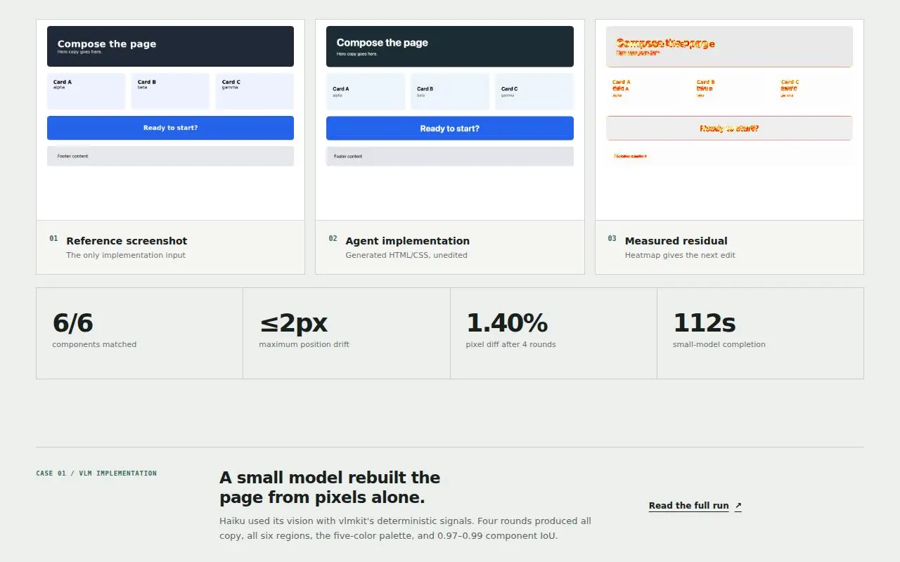
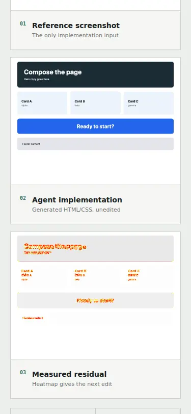
At tablet width each gallery figure becomes image | caption, and the caption cell stretches to the image height. Its two grid rows split that height, so the title ('Agent implementation') and its note ('Generated HTML/CSS, unedited') end up ~170px apart, the note floating mid-panel (S3 screens 2–4, S10 screens 2–3). | styles.css: .proof-gallery figcaption { align-content: start }. | L27 |
| D9 | eye L3 on S3 | .command-deck at 641–826px
At tablet width the command deck's terminal panel stops ~150px short of the deck's right border, leaving a dead dark band (S3 screens 7–8, S10 screens 7–8). The terminal text wraps early inside the narrowed column. grid-template-columns is minmax(260px, 0.34fr) minmax(0, 0.66fr). When the first track clamps to its 260px minimum, the remaining flex factor (0.66) is below 1, so only 66% of the leftover width is handed out. | styles.css: .command-deck grid-template-columns: minmax(260px, 34fr) minmax(0, 66fr). The ratio is the same, and the row always fills when the first track clamps. | L27 |
| D10 | eye L22 on S22 | .start and .skills-layout at 901–~990px
Just above the 900px collapse, the start and skills grids leave their rows short. At 920px the install panel ends at x≈835 and the skills catalog at x≈829, against a content edge of x≈883, so the right margin is roughly double the left gutter (S22, S23). The cause is the same fr arithmetic as D9. .start is minmax(0, 0.85fr) minmax(450px, 1.15fr) and .skills-layout is minmax(0, 0.82fr) minmax(460px, 1.18fr). Once the second track clamps to its minimum, the lone remaining factor is below 1. | styles.css: .start becomes minmax(0, 85fr) minmax(450px, 115fr), and .skills-layout minmax(0, 82fr) minmax(460px, 118fr). | L28, L29 |
| D11 | eye L2 on S2 | .hero-console figcaption at <=640px
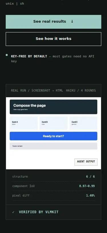
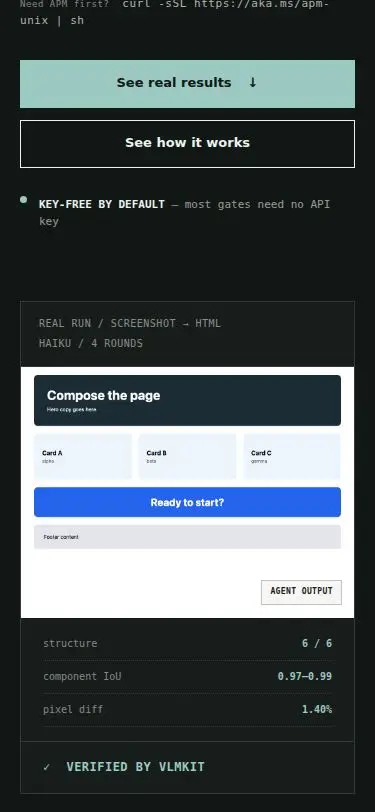
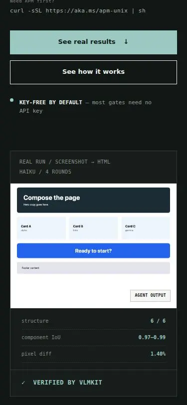
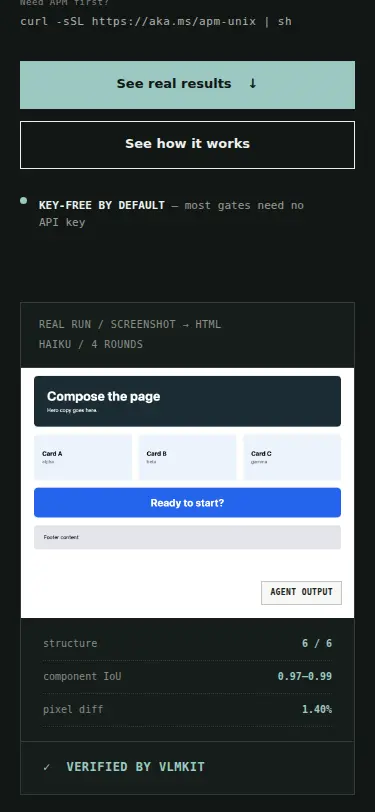
On a phone the console figcaption's two labels run together: 'REAL RUN / SCREENSHOT → HTML HAIKU / 4 ROUNDS', with ~6px between 'HTML' and 'HAIKU', so it reads as one phrase (S2 screen 2, S5, S7, S9). It is a space-between flex row with no gap and no wrap. | styles.css: .hero-console figcaption gets flex-wrap: wrap and gap: 4px 16px. | L25 |
| D12 | eye L6 on S6 | html[data-theme=dark] .commands
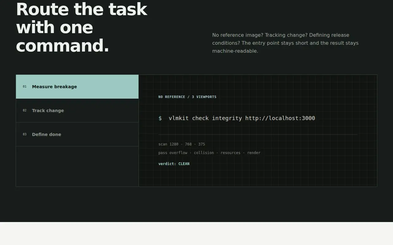
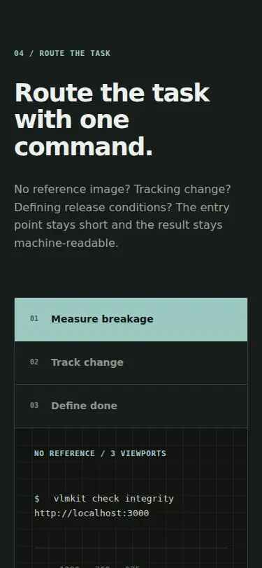
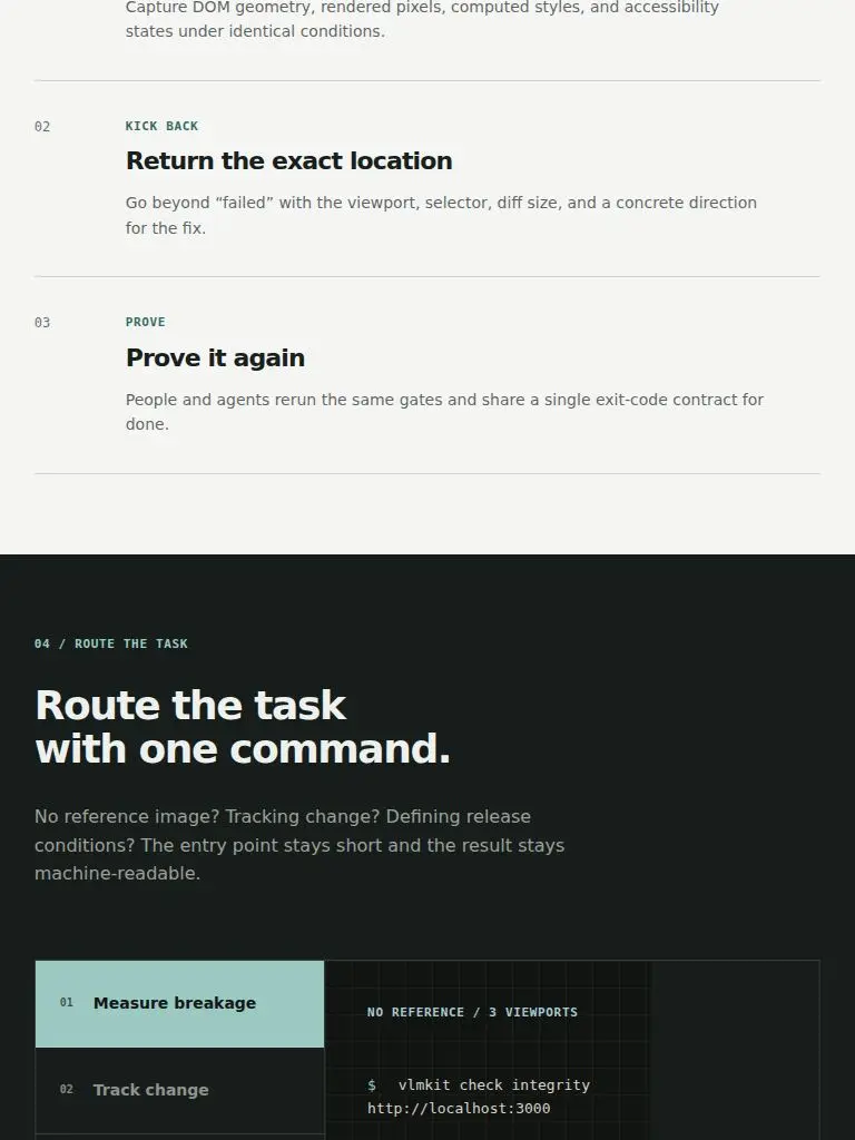
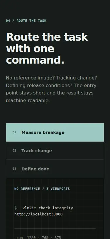
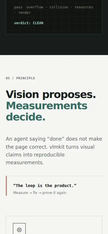
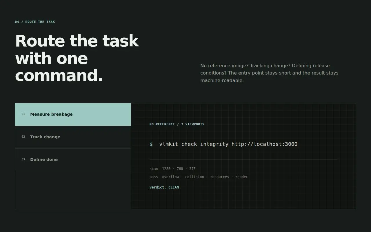
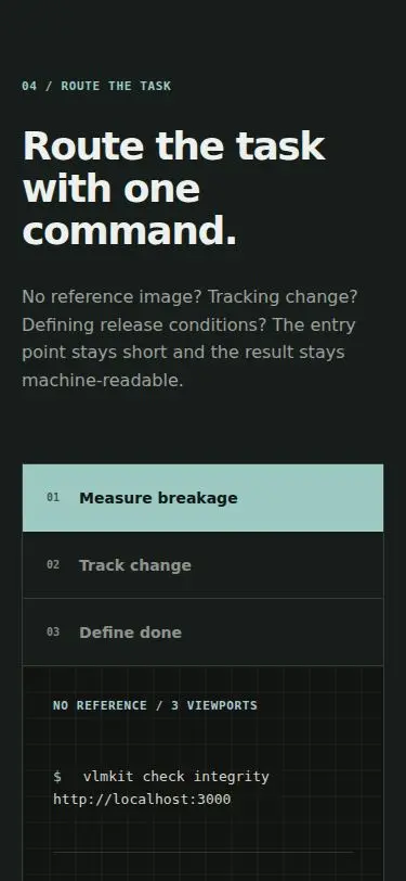
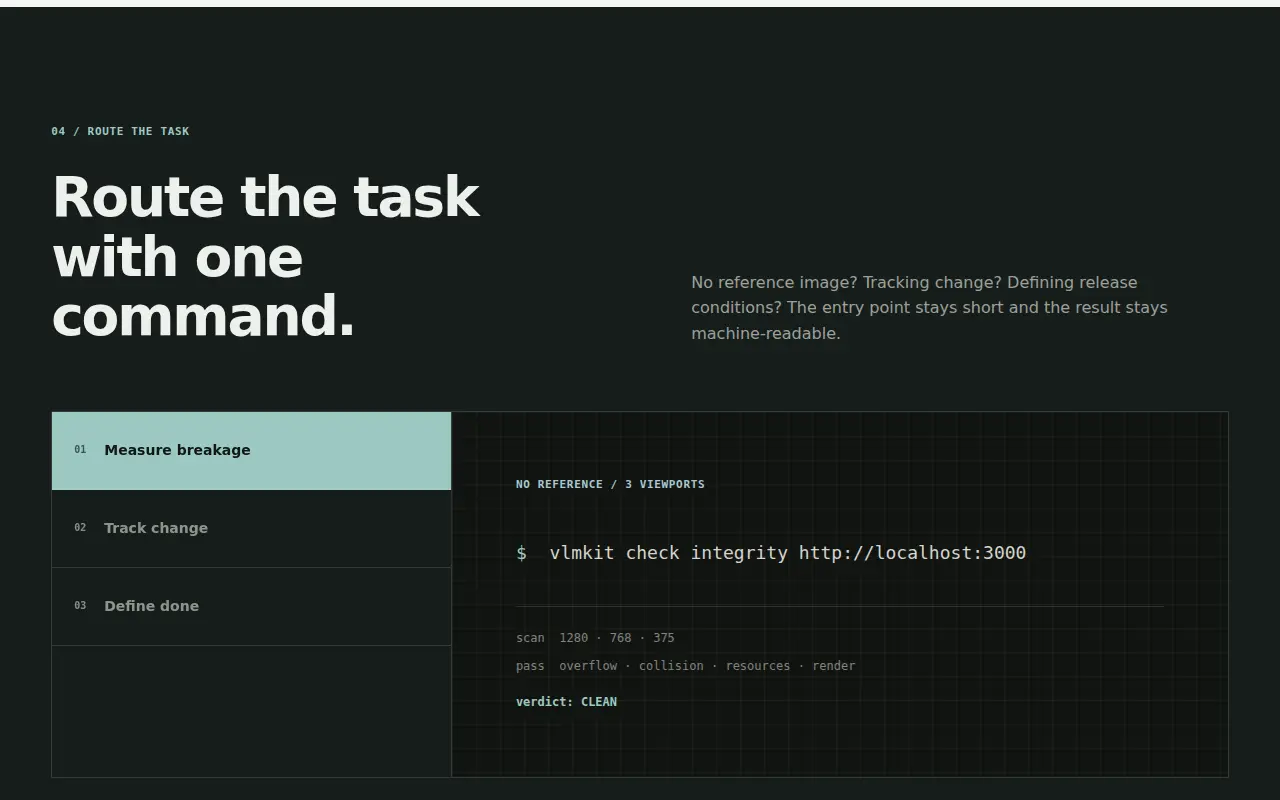
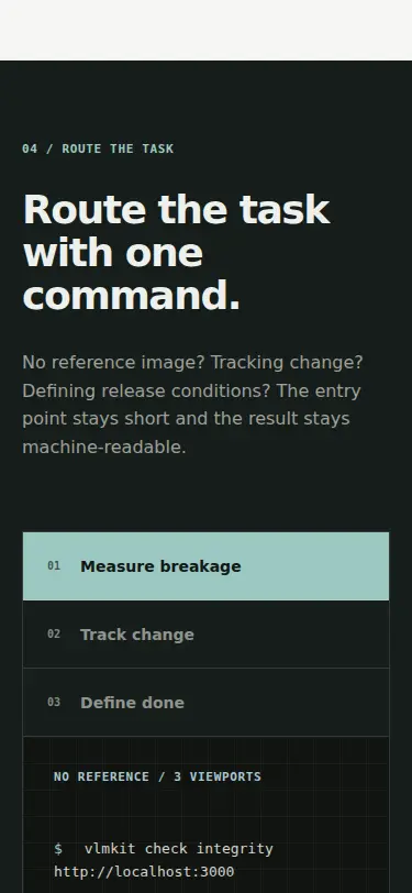
In dark theme, sections 03 THE LOOP (#131916), 04 ROUTE THE TASK (#111715) and 05 PRINCIPLE (#131916) merge into one ~2,400px dark field with no visible boundary. '04 / ROUTE THE TASK' just appears under the loop list (S6 screens 6–8, S7 screens 9–11, S8, S9). In light theme, 04 is the page's strong dark band. check color G7 shows these two surfaces are 74% of the painted area. | styles.css: html[data-theme=dark] .commands { background: var(--chrome); border-block: 1px solid var(--chrome-line) }. | L33 |
| D13 | eye L6 on S6 | html[data-theme=dark] .install-command
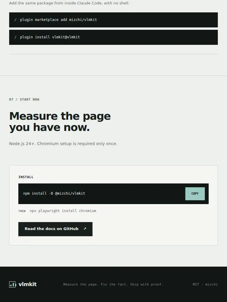
In dark theme the npm install bar (--ink #111715) sits on the install panel (--surface #131916) at almost the same value. The command's container disappears and COPY seems to float (S6 screens 12–13, S7 screens 17–18, S8/S9). This is the page's final call to action. | styles.css: html[data-theme=dark] .install-command and .skill-command { background: var(--chrome); box-shadow: inset 0 0 0 1px var(--chrome-line) }. The box-shadow adds no layout. | L34 |
| D14 | eye L14 on S14 | .display-controls (JA/EN, theme switch) focus ring
Keyboard focus on the locale toggle or the theme switch shows only a ~3px vertical coral sliver between the two buttons. .display-controls has overflow:hidden, which clips the rest of the 4px-offset ring. The two focused states look nearly identical (S14 vs S15), while the same style is a full ring on the GitHub link (S16). check a11y focus G8 and check interactions G12 both report focus✓ for these two controls. | styles.css: removed overflow: hidden from .display-controls. The buttons sit inside its border, so it clipped nothing but the focus ring. | L35, L36 |
| D15 | eye L17 on S17 | .terminal-output
The command-deck output loses its column alignment. scenarios.js pads the lines ('desktop diff 0.00%', 'mobile diff 0.00%', 'integrity PASS' / 'copy PASS' / 'layout PASS'), but the rendered spans collapse the runs of spaces, so 'diff' and 'PASS' start at a different x on every line (S17, S18, S19). | styles.css: .terminal-output > span { white-space: pre-wrap } so the space-padded scenario columns survive rendering and still wrap on narrow screens. | L39 |
| D16 | gate G11 | header.site-header>nav.site-nav>a (Skill)
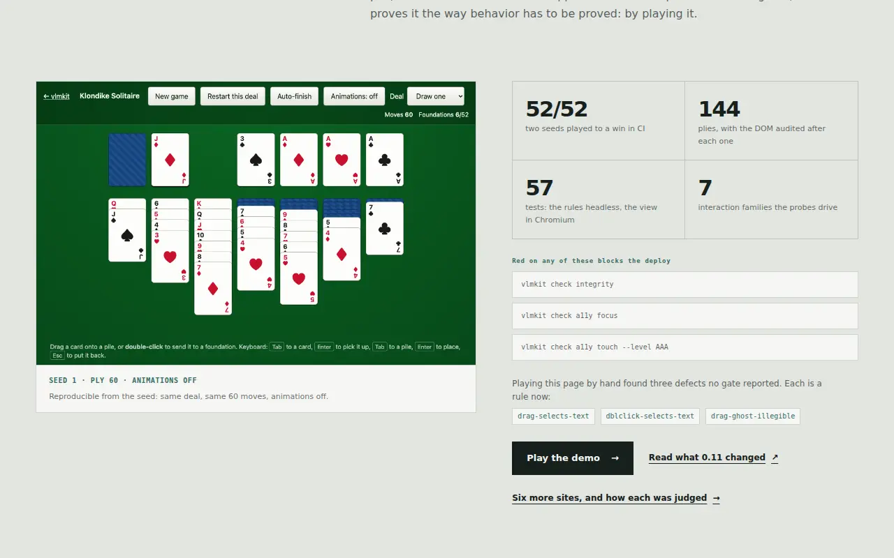
check a11y touch --level AAA reports the 'Skill' nav link at 41×44, under the 44px AAA target. The page's own site-links test says the header meets WCAG 2.5.5's 44px 'everywhere else', so this is the one header target that breaks that claim. It passes AA (G10). | styles.css: .site-nav a and .header-link get min-width: 44px and justify-content: center. | G19 |
| D17 | eye L20 on S20 | [data-copy-install] failure path (app.js)
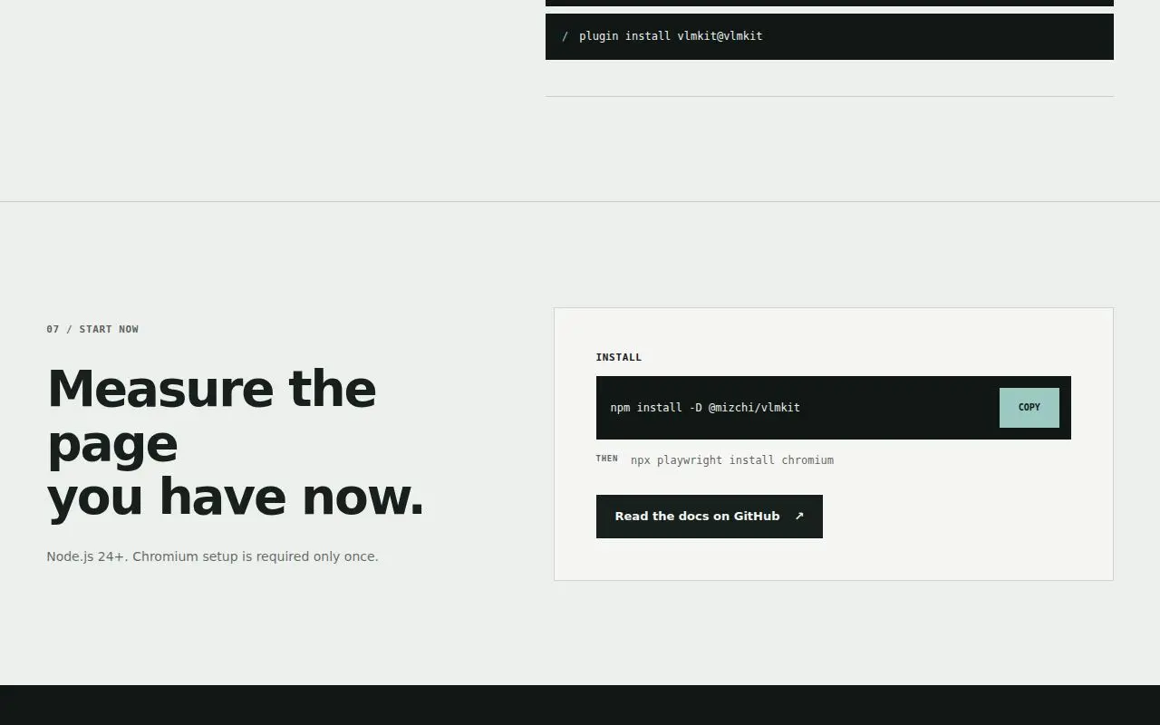
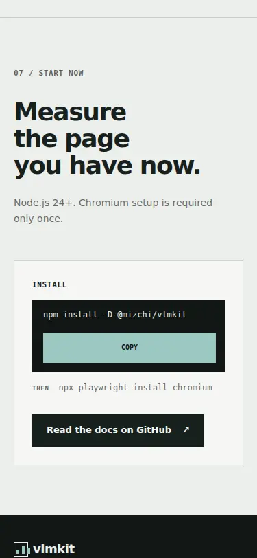
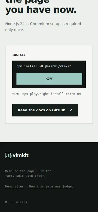
When the clipboard write fails, the page prints the bare command 'npm install -D @mizchi/vlmkit' in the green bold status style under the THEN line, with no word that the copy failed or what to do. It reads as a third command, or as a label for the docs button 8px below it (S20). Nothing is selected for the visitor either. | app.js: on a failed clipboard write, the command's <code> is selected with a Range, and the status reads a new start.copyFailed message. content.js adds it in both locales: EN 'Couldn't copy. The command is selected: press Ctrl+C or ⌘C.', JA 'コピーできませんでした。コマンドを選択したので、Ctrl+C / ⌘C でコピーしてください。'. The status carries data-state=copied|failed, and styles.css sets the failed state in muted ink rather than the success green. Follow-up from S40/S41: .copy-status gets padding-bottom: 8px, so a message clears the docs button. The empty state stays 28px through min-height with border-box. .copy-status joins the :lang(ja) auto-phrase list, so the two-line Japanese message breaks between phrases. | L42 |
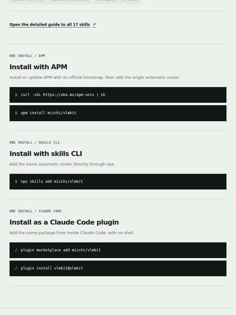
| D18 | eye L1 on S1 | .site-footer p
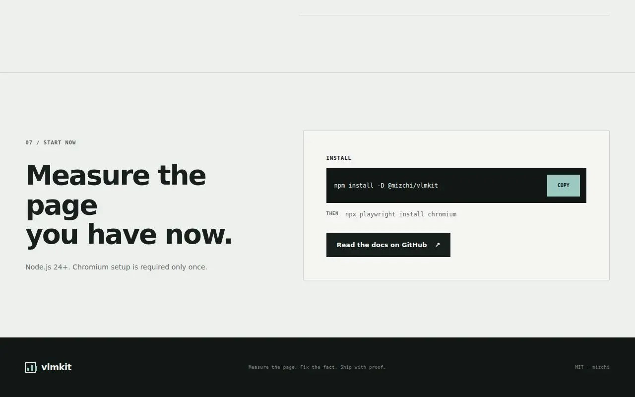
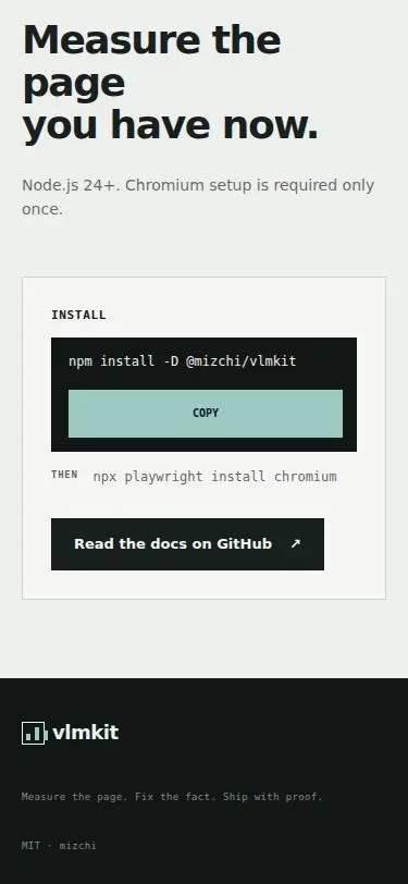
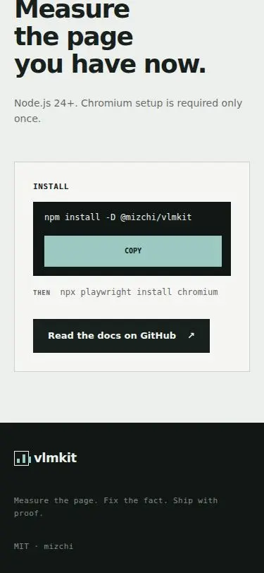
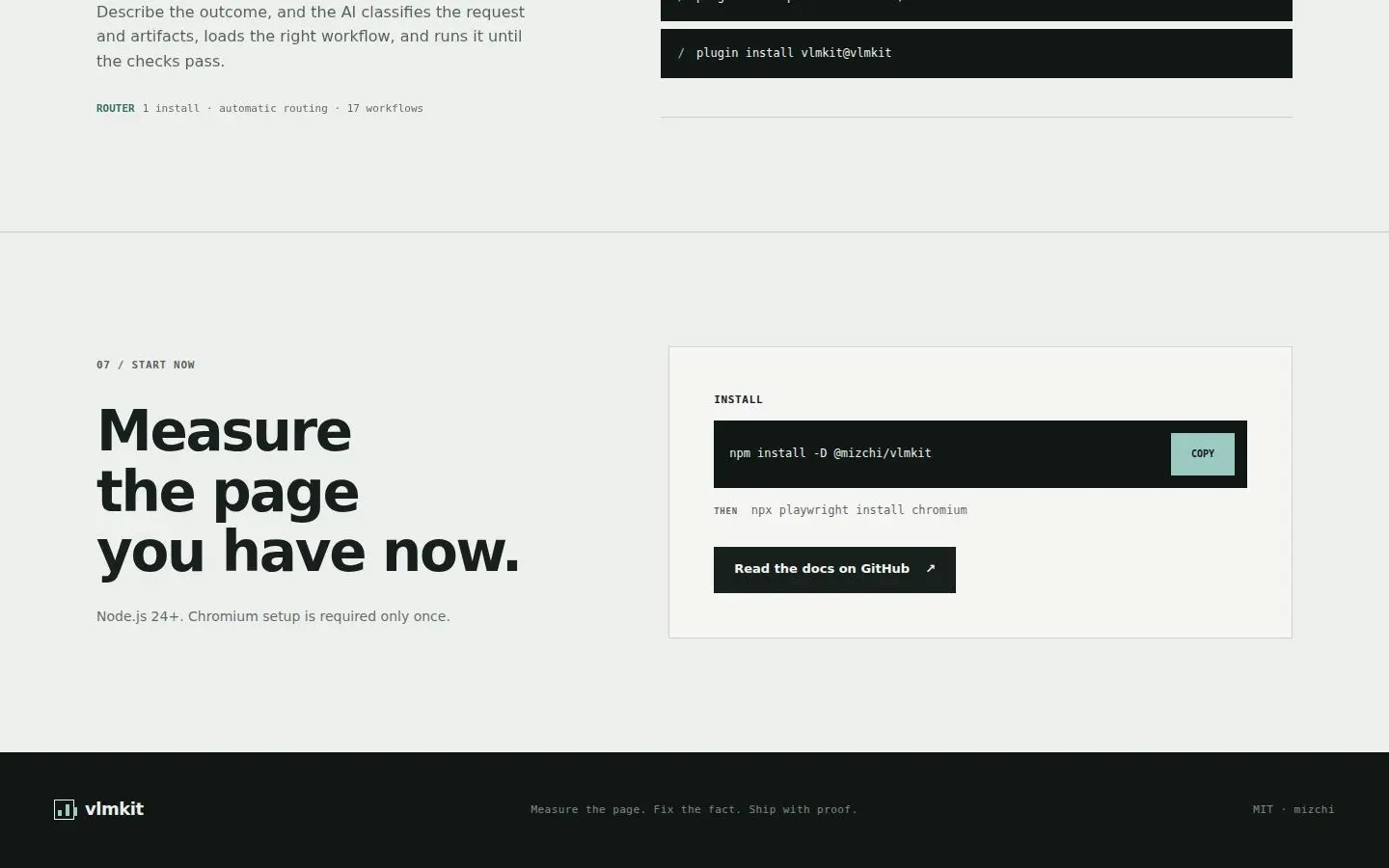
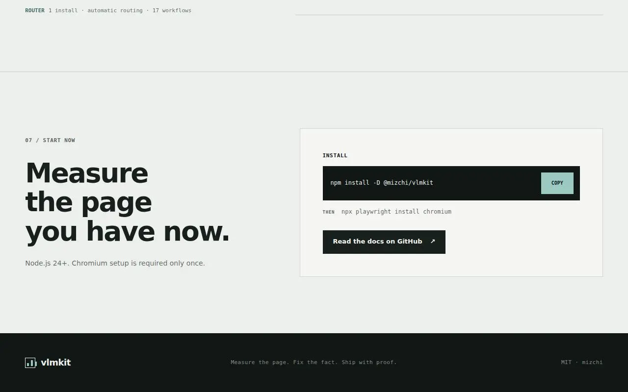
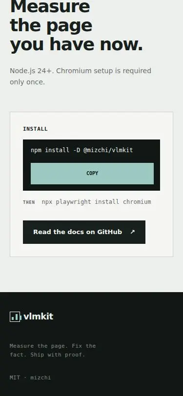
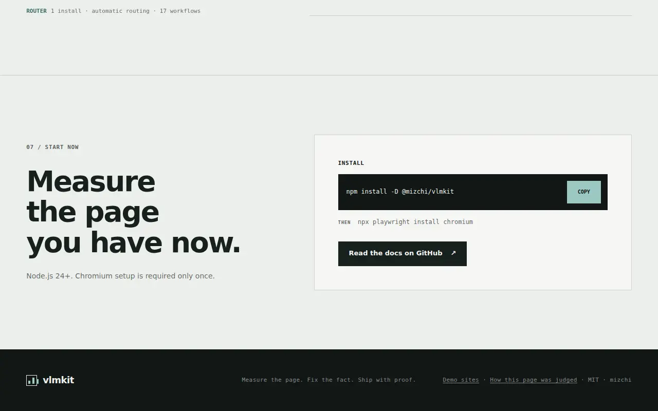
The footer tagline 'Measure the page. Fix the fact. Ship with proof.' and 'MIT · mizchi' are 9px mono (S1 screen 13, S2 screen 18). The page's closing line is set as fine print and is hard to read at arm's length. The Japanese tagline is the same (S4 screen 12). | styles.css: .site-footer p from 9px to 11px (same colour, which already clears 4.5:1). | L43 |
| D19 | eye L11 on S11 | .site-header at <=900px
On a phone the header's controls group sits flush against the header's top edge, about 1px under the dogfood strip, because the header has no top padding and row 1 is exactly as tall as the group. The second row's 'Playable demo →' text starts ~5px right of the brand's left edge, from the link's padding-left (S11, S12; the same at tablet in S3 screen 1). | styles.css, ≤900px: .site-header gets padding-top: 8px, and .site-nav gets margin-left: -5px to cancel the link's padding-left, so its text starts on the brand's edge. | L25 |
| D20 | eye L2 on S2 | .proof-heading, .demo-heading at <=900px
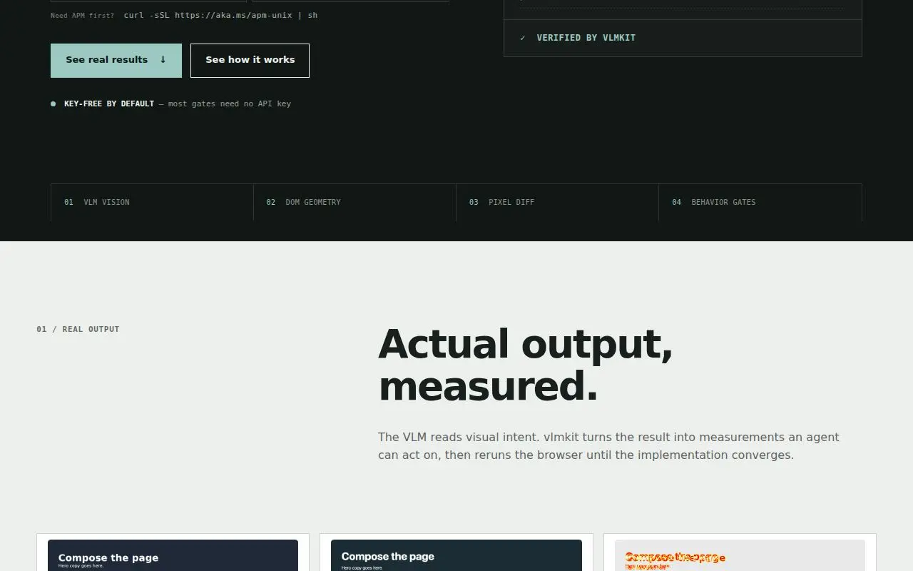
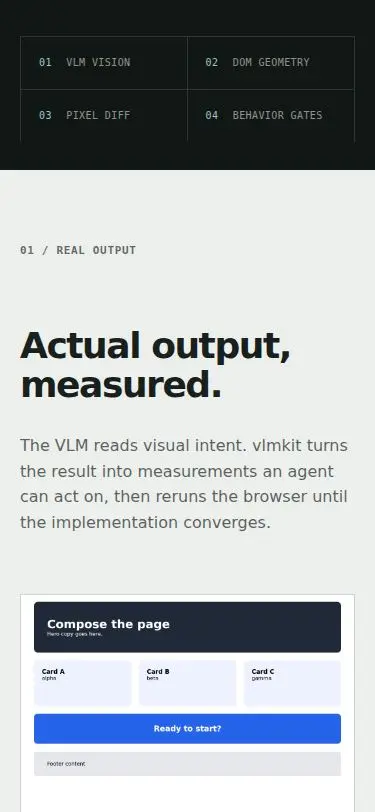
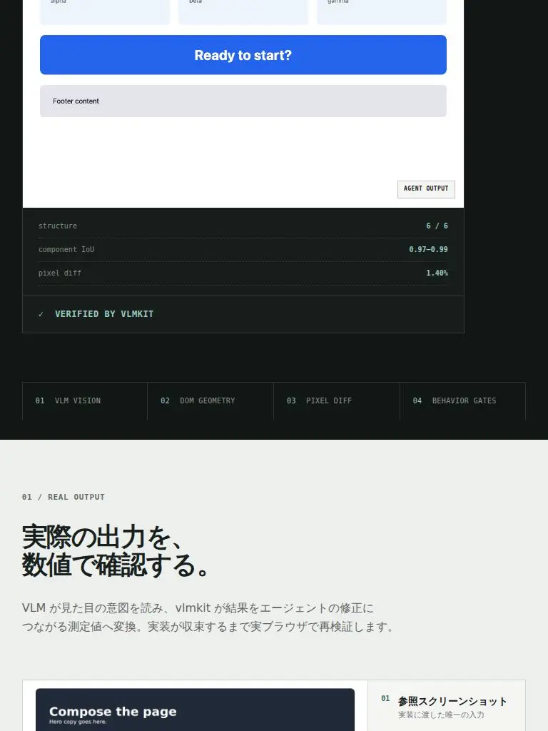
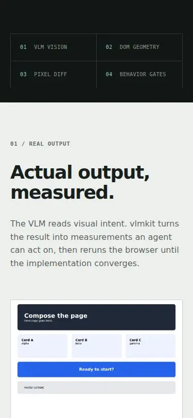
When the 01 and 02 heading grids collapse to one column, their 40–61px grid gap stacks on the label's 28px margin. '01 / REAL OUTPUT' then sits ~68px above its h2 on a phone and ~100px on tablet, while 03, 04 and 06 keep 28px (S2 screen 3, S3 screen 2). The label floats instead of heading its section. | styles.css, ≤900px: .proof-heading and .demo-heading get row-gap: 0, so the label keeps only its 28px margin. | L25 |
| D21 | eye L2 on S2 | .install-next
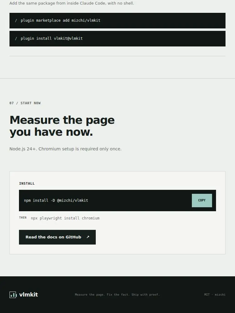
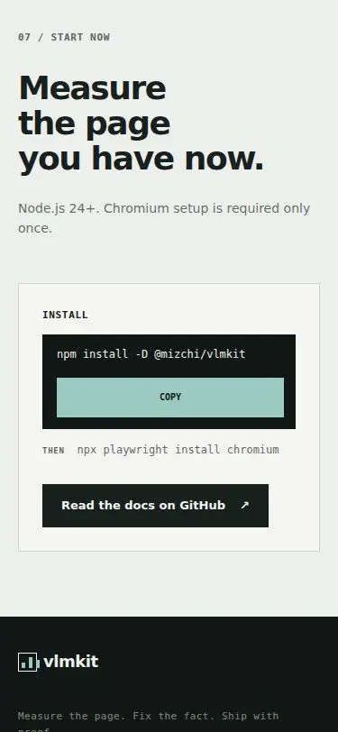
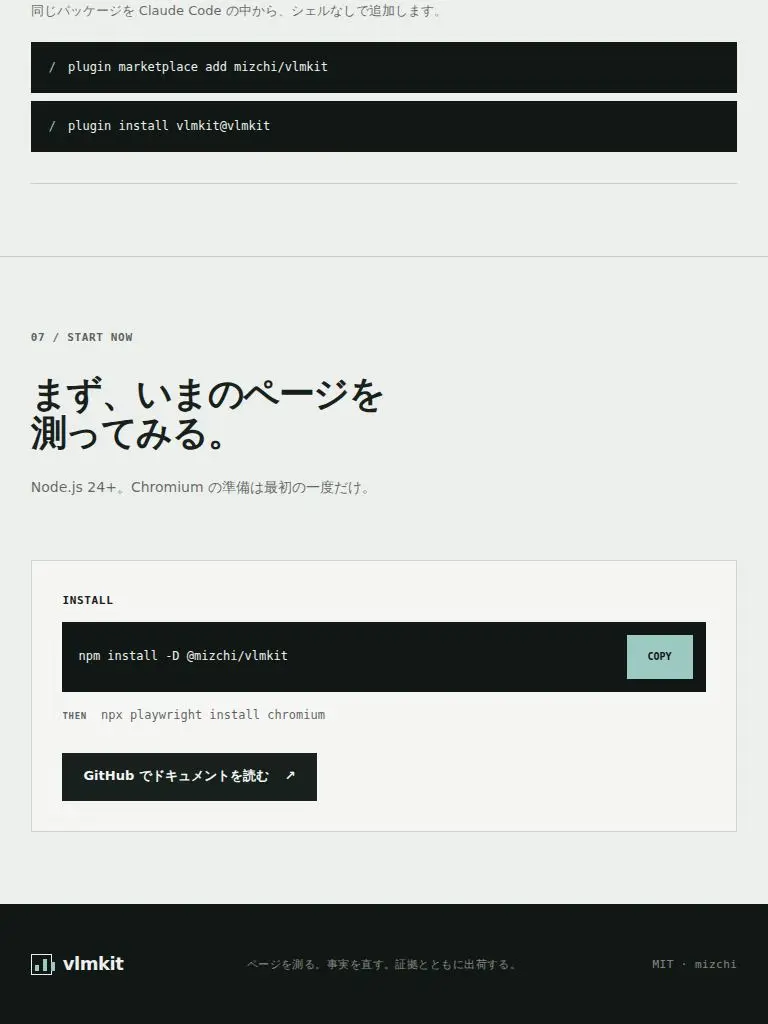
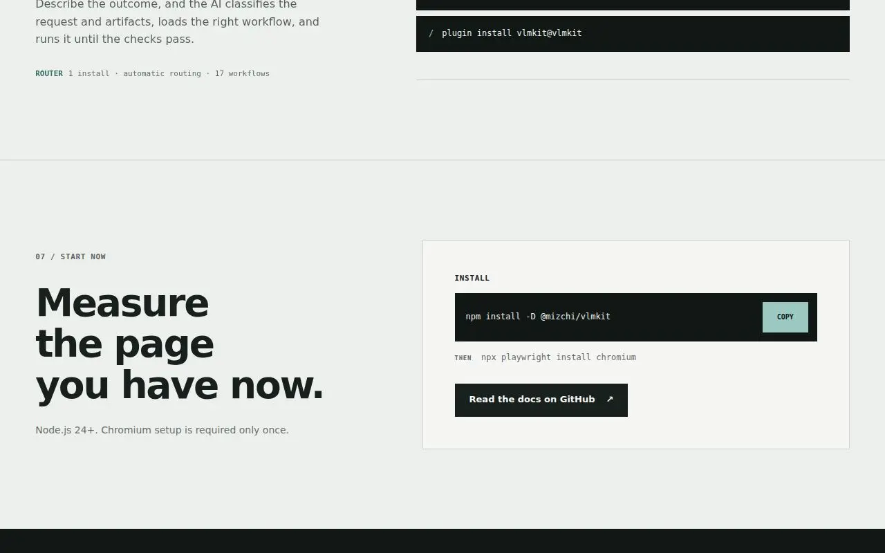
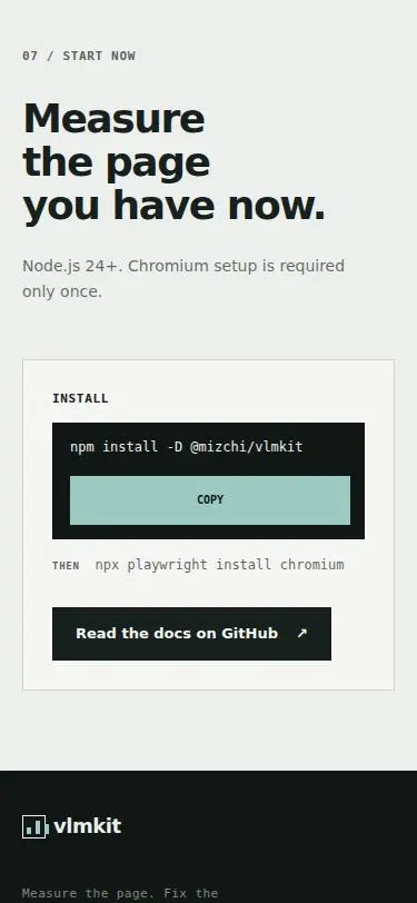
In the start panel the 9px 'THEN' label is top-aligned with the 12px 'npx playwright install chromium', so it sits a few px above the command's baseline (S1 screen 12, S2 screen 17). | styles.css: .install-next { align-items: baseline }. | L43 |
| D22 | eye L1 on S1 | .skills-intro at >=901px
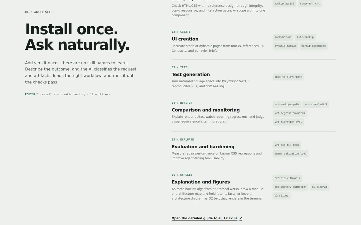
At desktop the 06 / AGENT SKILL section's left column holds only the intro at the top, then stays empty for ~1,900px while the catalog and three installers run down the right. Two whole screens are 45% blank (S1 screens 10–12, S6, S4 and S8 in Japanese). It reads unbalanced and unfinished. | styles.css: .skills-intro { position: sticky; top: 40px } at ≥901px, reset to static at ≤900px. .skills-layout already has align-items: start. | L43 |
| D23 | eye L19 on S19 | .command-tabs button focus ring
The focus ring on a command tab never closes. Its right edge is painted over by the terminal panel, the later grid item, and its left edge falls outside the deck, so only two horizontal coral bars show (S18, S19). It is still identifiable, but it is not the page's ring. | styles.css: .command-tabs { position: relative; z-index: 1 }, so the tab list, focus rings included, paints above the terminal grid item. | L39 |
| D24 | eye L1 on S1 | .demo-release > span:first-child ('NEW IN 0.11'), demo.changelog
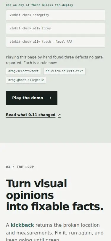
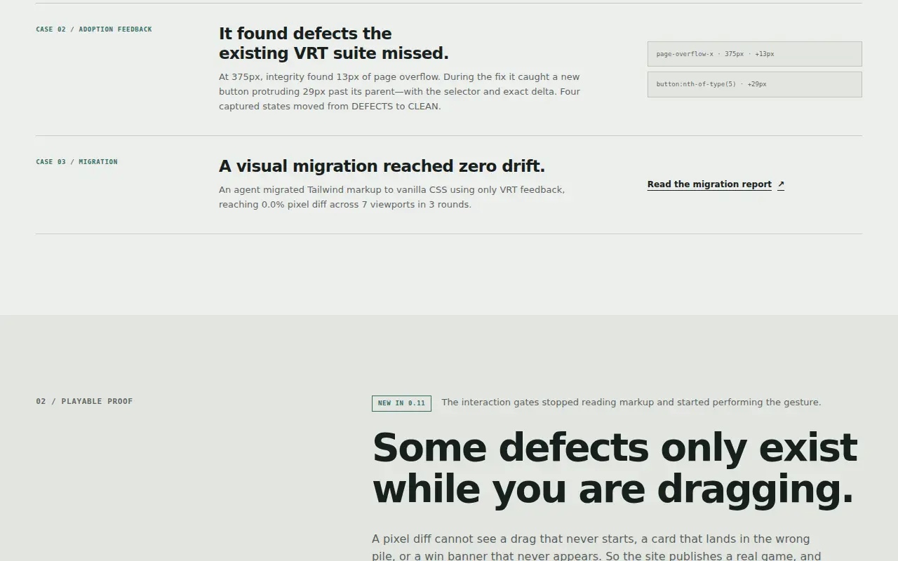
Dated copy. The demo section's badge says 'NEW IN 0.11' and its link says 'Read what 0.11 changed', while the hero eyebrow on the same page says v0.23.0 (S1 screens 1 and 4). To a first-time visitor the 'new' feature is twelve minor releases old, and that makes the page look unmaintained. | accepted Left as is. page.test.mjs pins the exact string, assert.match(section, /NEW IN 0\.11/), and the CHANGELOG link, and the brief limits edits to the page's own runtime files and asks for the contract tests to stay green. Rewording the badge ('SINCE 0.11', or dropping it) needs that assertion changed in the same commit, which is the maintainers' call. Recommended: retire the badge, or state it as history ('Since 0.11, the interaction gates perform the gesture'). | — |
| D25 | eye L25 on S25 | .site-footer p (<=640px)
Introduced by the D18 fix: at 11px the footer tagline no longer fits a 335px phone column, and wraps as 'Measure the page. Fix the fact. Ship with / proof.' with 'proof.' alone (S25 screens 17–18). | styles.css: .site-footer p gets text-wrap: balance. One line where it fits; where it wraps, the lines are even. | L26 |
| D26 | eye L31 on S31 | :lang(ja) section leads (.hero-lead, .proof-heading p, .demo lead, .section-heading p, .commands-intro p, .principle-copy p, .skills-intro p)
The large Japanese lead paragraphs still break inside words: 'スク / リーンショット' and 'でき / る' in the hero lead, 'ペー / ジ' in the 21px principle lead, 'あり / ません' in the skills lead (S31 screens 1, 8, 9). D5's auto-phrase covered headings and one-line labels, not these display-size leads. | styles.css: the :lang(ja) word-break: auto-phrase list now includes the display-size leads (hero lead, 01/02 heading leads, 03/04 intro paragraphs, principle lead, skills lead). Measured with the scratch script at 1280 and 375: no overflow (scrollWidth equals width in every case), and スクリーンショット, ページ and ありません stay whole. Card descriptions and other small text keep normal Japanese breaking. | L32 |
| D27 | gate G34 | :lang(ja) auto-phrase elements at 320px (#commands-title)
Introduced by the D5/D26 fix. check breakpoints --sweep on ja reports 'Horizontal overflow at 320px (up to 19px past the viewport)'. The round-1 sweep (G14) was clean. A scratch probe names the element: the 04 h2 phrase 'やりたいことから、' is 324px at 36px and becomes one unbreakable unit under word-break: auto-phrase. In the one-column .commands-intro grid its min-content widens the track to 319px, which pushes the heading, lead and label 19px past a 320px viewport. auto-phrase has no emergency fallback of its own, so a phrase longer than the line must be allowed to break. | styles.css: the :lang(ja) auto-phrase rule adds overflow-wrap: anywhere. A phrase longer than its line may break inside as a last resort, and min-content no longer counts the whole phrase. Scratch probe at 320px: scrollWidth 320 = clientWidth. The heading breaks at 1280 and 375 are unchanged. | G38 |
| D28 | eye L46 on S46 | .hero-bootstrap, .hero-status, .start-note, .skill-installer p (phone); running text generally
Short last lines and a mid-URL break in the phone hero and install copy (S46; the first two already in L2, S2). The bootstrap line breaks 'curl -sSL https://aka.ms/apm-' / 'unix | sh' at the URL's hyphen, so the command a newcomer may retype reads as two pieces, and in Japanese it leaves 'sh' alone ('…apm-unix |' / 'sh'). Four lines end in one short word: the status line ('…no API / key'), the start note ('…required only / once.'), the SKILLS CLI description ('…directly through / npx.') and a step description ('…identical / conditions.'). A scratch scan finds 17 one-word last lines at 375, 29 at 320 and 10 at 1280 (e.g. '…Each is a rule / now:', '…only when / needed.'), some of them intended heading breaks. Nothing sets text-wrap on running text. | styles.css has two changes.
(1) body sets text-wrap: pretty, so running text in both languages inherits it. The headings keep their explicit balance. A scratch probe shows the hero h1 unchanged at 375 and 320 in en and ja.
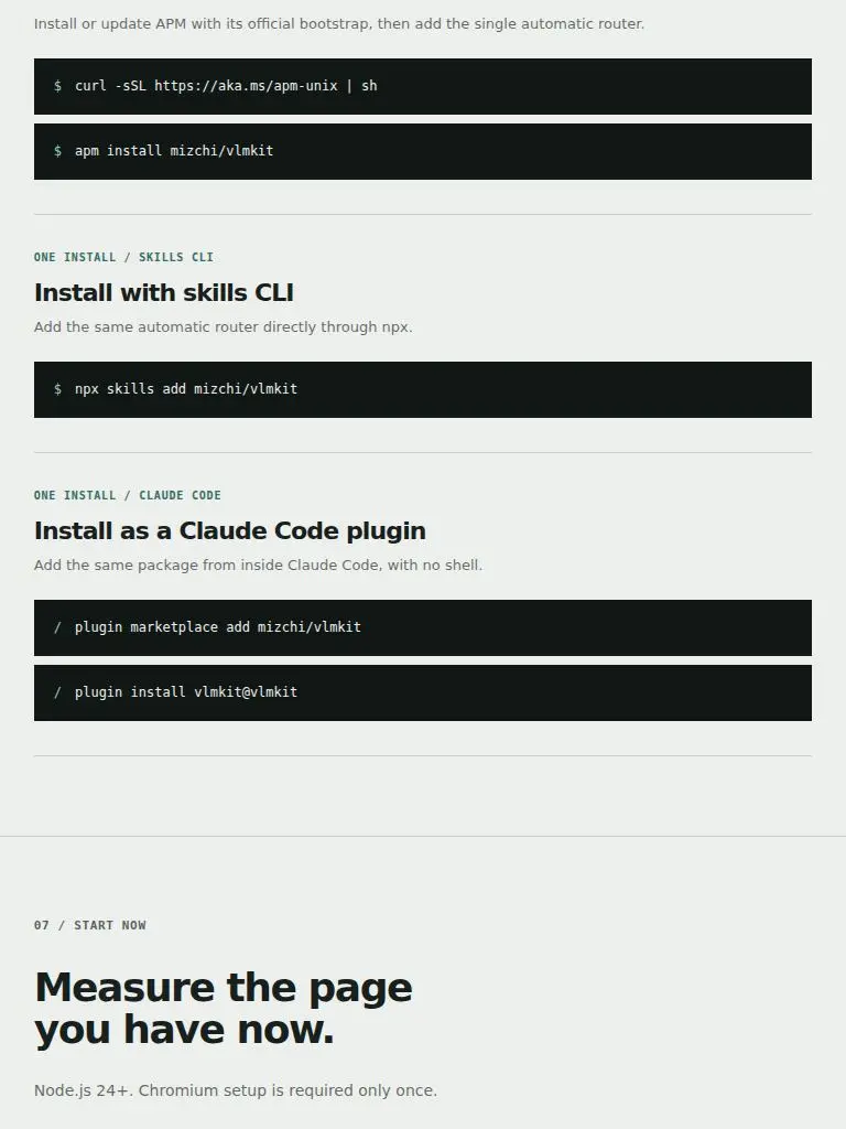
(2) .hero-bootstrap is now a wrapping flex row: label and code with a 4px/13px gap, and the code's 7px margin is gone. When the two do not fit on one line, the whole command drops to its own line (the command is 272px, and it fits the 280px column at 320). The 13px gap equals the old space plus the margin, and at 1280 the probe gives the same geometry (h=18, code.x=154) as before.
Probe at 375: 'Need APM first? / curl -sSL https://aka.ms/apm-unix | sh', '…need no / API key', '…is required / only once.', '…directly / through npx.' In ja: 'APM が未導入なら / curl … | sh', '…ゲートは / API キー不要', '…準備は / 最初の一度だけ。'
One-word last lines, en: 17→12 at 375, 29→16 at 320, 10→5 at 1280. The rest are the intended two-phrase heading breaks, two-word commands and stat labels in narrow cells, and long last words ('machine-readable.').
No overflow at 320 (scrollWidth 320). | L47 |
| D29 | eye L51 on S51 | :lang(ja) running text (card, step, skill-group and meta-entry descriptions, stat labels)
The Japanese small text still breaks inside words, at desktop width too. The skill-group descriptions split katakana loanwords in half: 'レスポンシ / ブ', 'ペー / ジを再現', 'ド / リフト', 'モジュー / ル構成'. There are also '同 / 等性', 'ツール自 / 体' and '求 / めず'. The case bodies split '新し / い', 'なりま / した。', '5 / 色' and '7 / ビューポート', and the stat and rule notes '表示 / は' and 'いず / れも' (S51 screens 3–5, 8–10). D5/D26 gave auto-phrase only to headings, labels and display leads, and F25 kept small text on ordinary breaking on purpose. On the desktop the result is phrase-broken headings over descriptions cut mid-word, which is the English page's standard (never mid-word) not met. Scratch count: 10 of 41 breaks inside a word at 1280, 5/35 at 768, 16/76 at 375, 19/99 at 320. | styles.css: word-break: auto-phrase and its emergency exit, overflow-wrap: anywhere, move from the 17-selector :lang(ja) :is(…) list onto html:lang(ja). Every piece of Japanese text now breaks between phrases, and the Latin text and the English page are untouched. The comment says why the scope grew.
Scratch measurement (midword.mjs), inside-word breaks: 10/41→2/41 at 1280, 5/35→3/35 at 768, 16/76→2/78 at 375 and 19/99→4/101 at 320. The page gains 2 lines (≤40px) at 375 and 320, and scrollWidth equals the viewport at every width. The remaining breaks are the segmenter's misses ('振る / 舞い', '29px は / み出す'), the 768 caption '参照スクリーンショッ / ト' (a single phrase wider than its line; handled separately) and, at 320, 'やりたいことか / ら、' (the D27 phrase that is wider than a 280px line). | L54 |
| D30 | eye L52 on S52 | .proof-gallery figure at 641–900px (caption column minmax(180px, 0.42fr))
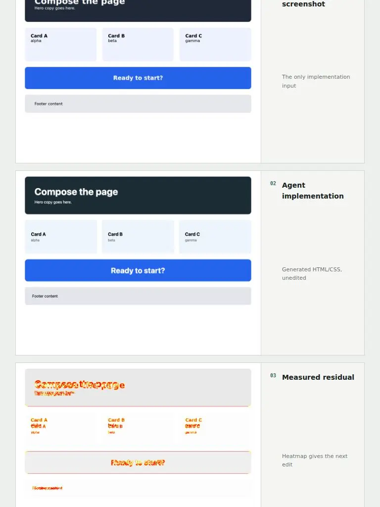
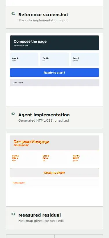
D5's tablet case is still open. At 768 the first gallery caption reads '参照スクリーンショッ / ト' with ト alone (S52). The caption column's 180px floor and the 0.42fr share leave the title 120–148px between 641 and ~790px, and the one phrase 参照スクリーンショット needs 154px, so any break has to fall inside the word. D5 was verified on the phone (V13), where the caption fits. | styles.css (≤900px): the gallery figure's caption column is now minmax(220px, 0.42fr) instead of minmax(180px, 0.42fr). The title gets at least 160px, and 参照スクリーンショット (154px) and 実装に渡した唯一の入力 fit on one line at every tablet width. Scratch probe at 641/680/700/740/768/800 gives one line in ja. The English still wraps only at word boundaries ('Reference / screenshot'). The cost is the screenshot column: 408→368px wide at 641 and 496→485 at 768, and nothing changes from ~820px up. No overflow (scrollWidth equals the viewport). | L53 |
| D31 | eye L53 on S53 | .proof-metrics article, .demo-metrics li (align-content: center)
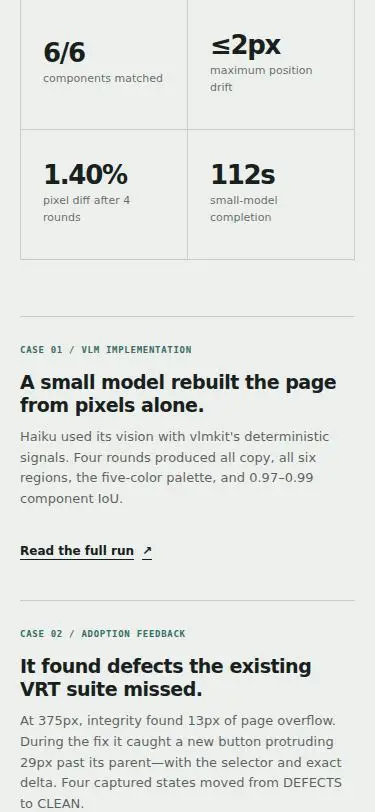
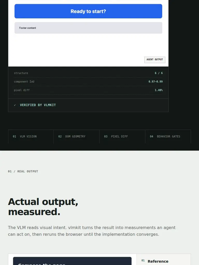
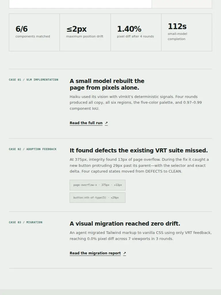
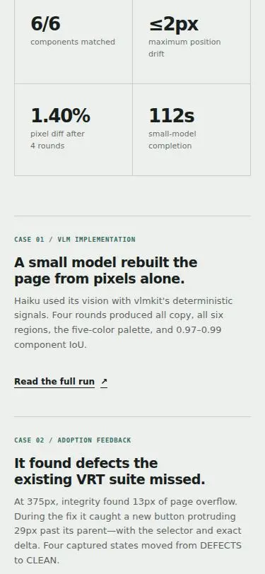
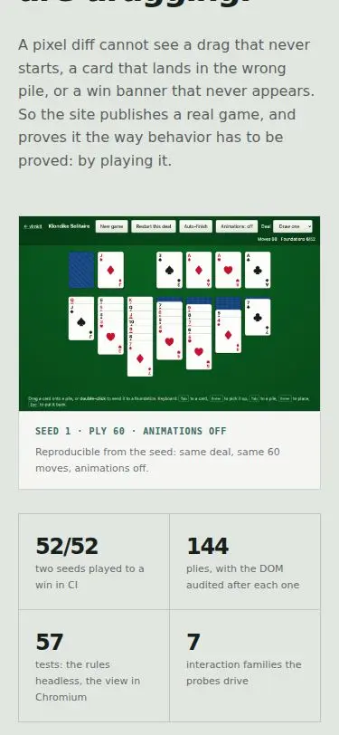
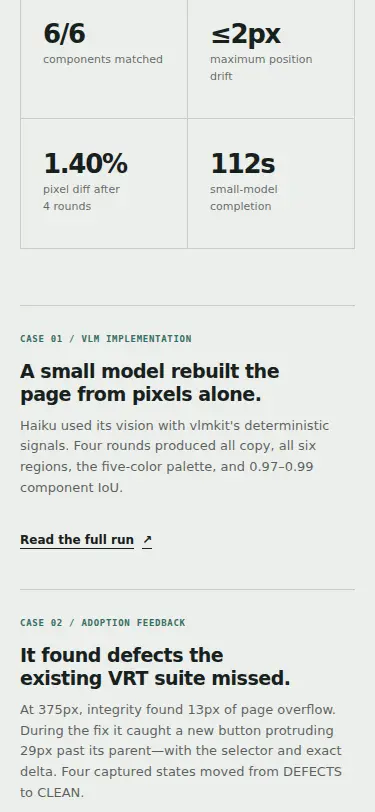
Stat numbers leave their row whenever a neighbouring label wraps to a different number of lines. Each cell centres its number+label block, so a longer label lifts its number by half a line (~8–9px). Seen at: ja 768, 1.40% above 6/6, ≤2px and 112s (S53 screen 4); en 1280, 144 above 52/52 and 7 below 57 in the demo metrics (S48/S49 screen 5); en 375, ≤2px above 6/6 (S47 screen 5). In a grid of big figures the numbers are what the eye lines up, and they are the one thing that should share a line. | styles.css: .proof-metrics article and .demo-metrics li use align-content: start instead of center. The top padding goes to 32px (proof) and 24px (demo), so a one-line cell's figure stays about where centring put it (36–41px and 26px). Scratch probe (stats.mjs), figure offset per cell in each row, en and ja at 1280/768/375: every proof cell is 32px and every demo cell 24px, the same in every row. The cells in a row share one height (e.g. 113/113, 124/124). No other rule changed. | L58 |
| D32 | eye L86 on S86 | .site-footer .footer-links
The new footer links break inside a link at every width below about 1230px: "How / this page was judged" at 768 (with a third line that begins with "·"), "How this page / was judged" at 900 and at 375, four lines with two separators left at line ends at 641. Cause: the links joined the licence in the footer's right grid column, which the 1fr auto 1fr grid sizes for a short item ("MIT · mizchi"), and the paragraph is one run of text that text-wrap: balance splits wherever the halves come out even. Seen in L81, L85, L86, L87 and L88; no gate reported it (G83's matrix and G84 were clean of it). | The footer's centre column now holds the tagline and, under it, "Demo sites · How this page was judged" (`.footer-center`, a centred grid with an 8px gap; start-aligned in the ≤640px single column). "MIT · mizchi" is alone in the right column again, as it was before this round. Each footer link is `white-space: nowrap`, so a link can no longer break inside itself. `.site-footer p:last-child` became `.site-footer > p:last-child` so the rule that right-aligns the licence does not also reach the links paragraph, which is now the last child of the centre column. | L92 |
| D33 | gate G97 | .site-footer .footer-links a
The two new footer links are the page's only undersized tap targets: 71x13 ("Demo sites") and 170x13 ("How this page was judged"), which G97 passes only by WCAG 2.5.8's inline exception ("in a sentence"). R3 left the page at 0 undersized targets at AA and AAA (G73, G74), every other text link here has a 44px min-height (.demo-changelog, the case-study links), and the page shows `check a11y touch --level AAA` among the gates that block a deploy. Two 13px links set on one line with a separator are not a sentence in any sense a thumb cares about. | `.site-footer .footer-links a` is now `display: inline-flex; min-height: 44px; align-items: center`, the same construction as `.demo-changelog`, and the centre column's 8px gap is gone because the links' own height now spaces them from the tagline (about 15px of air above the text). Nothing else in the footer moves: its min-height is 120px and the centre block is 60px tall. | G102 |
| D34 | eye L101 on S101 | .site-footer .footer-links a:focus-visible
Keyboard focus on either footer link draws the page's copper ring through the tagline above it (S101: across 'fact. Ship'; S102: across 事実を直す。証拠とともに). D33's 44px boxes start where the tagline's line box ends and the ring sits 7px outside the box (3px outline, 4px offset), so there is no room for it. The tap targets are right; the space above them is not. | The footer's centre column has a 10px gap again: the ring's 7px plus 3px of clearance, so a focused link's ring ends above the space between the lines instead of on the tagline. The links keep their 44px boxes (D33). | L103 |