 Does it look designed?
check composition
Headings that sit closer to the section above
Proximity, alignment and contrast as measurements. This fixture is the intact composition page plus one rule that swaps the gaps around each heading.
Open the page under test · fixtures/composition/proximity-broken.html
Run it
vlmkit check composition fixtures/composition/proximity-broken.html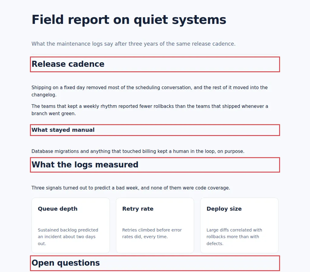
What to look at
Each heading is 12px under the block above and 44px over the content it labels, so it reads as belonging upward. The gate reports the ambiguity and the gap that would remove it, never which gap is correct.
The fix
Put more space above each heading than below it.
What vlmkit printed
vlmkit check composition fixtures/composition/proximity-broken.html · exit 0
vlmkit check composition
source: fixtures/composition/proximity-broken.html

verdict: UNBALANCED (4 finding(s))
  exits 0 — 4 warn(s) did not fail this command. To gate on one: --rule proximity-inversion=suspect
  measured: 4 label(s), 3 heading level(s), 21 wide block(s) on 2 left / 2 right rail(s) — from 30 visible box(es)
  5 label(s) not judged: they open a box that paints its own group edge, so nothing above them could be mis-grouped with

Type hierarchy (largest instance of each declared level)
  h1     40px / 700   div.shell>header.masthead>h1
  h2     26px / 700   div.shell>section>h2
  h3     18px / 700   section>div.subsection>h3
  body 15px, largest 40px (2.67x), heaviest +300 weight

Group gaps: 16px between heading-led groups vs 44px inside them (0.36x, 6 sample(s)). Context only — intact pages measure 0.86-3.00x, so this cannot carry a verdict.

Findings
  ! [proximity-inversion]: div.shell>section>h2 (h2) sits 12px below div.shell>header.masthead but 44px above the content it labels, inside div.shell>section — a label reads as belonging to whatever it is CLOSEST to, so this one groups upward. Reduce the gap under it below 19px, or widen the gap above it. This reports the ambiguity, not which gap is correct.
  ! [proximity-inversion]: section>div.subsection>h3 (h3) sits 28px below div.shell>section>p but 44px above the content it labels, inside div.shell>section>div.subsection — a label reads as belonging to whatever it is CLOSEST to, so this one groups upward. Reduce the gap under it below 41px, or widen the gap above it. This reports the ambiguity, not which gap is correct.
  ! [proximity-inversion]: div.shell>section>h2 (h2) sits 12px below div.shell>section but 44px above the content it labels, inside div.shell>section — a label reads as belonging to whatever it is CLOSEST to, so this one groups upward. Reduce the gap under it below 19px, or widen the gap above it. This reports the ambiguity, not which gap is correct.
  ! [proximity-inversion]: div.shell>section>h2 (h2) sits 11.9px below div.shell>section but 44px above the content it labels, inside div.shell>section — a label reads as belonging to whatever it is CLOSEST to, so this one groups upward. Reduce the gap under it below 18.9px, or widen the gap above it. This reports the ambiguity, not which gap is correct.